Understanding where your people contribute to and who they collaborate with is hard, but necessary. You can create charts tailored to your organization and easily visualize the involvement of your people in certain fields and client projects. Unlock valuable time analytics to support your decision-making.
Trusted by users and teams at
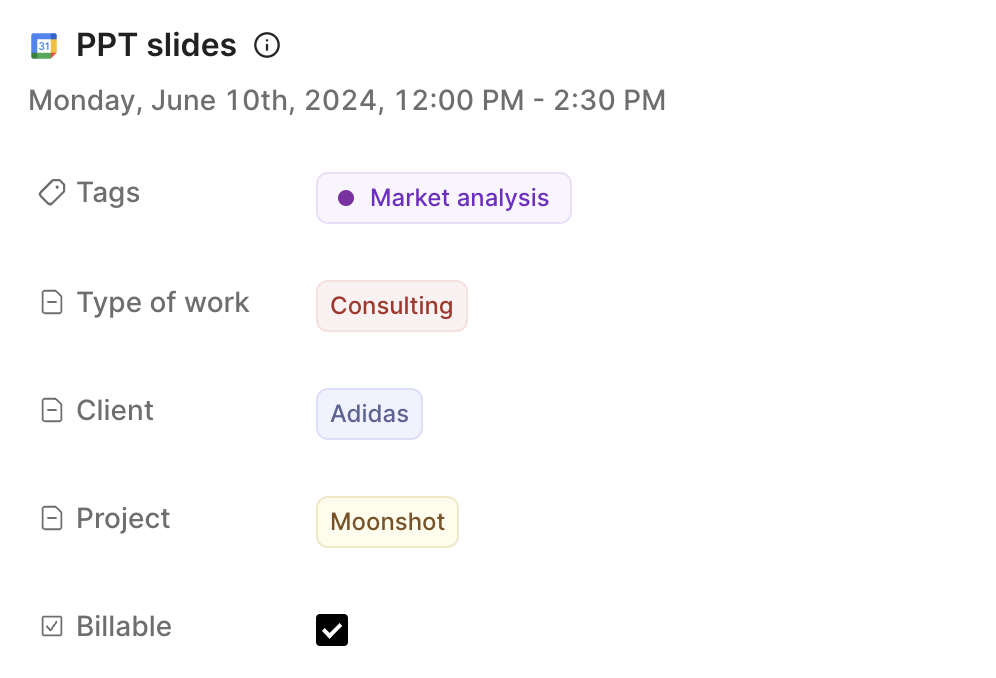
Want to categorize your calendar events into some buckets? Wish you could add additional information to your calendar events, like customer name or project name? Using tags and properties can help you add any metadata to your events.
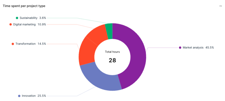
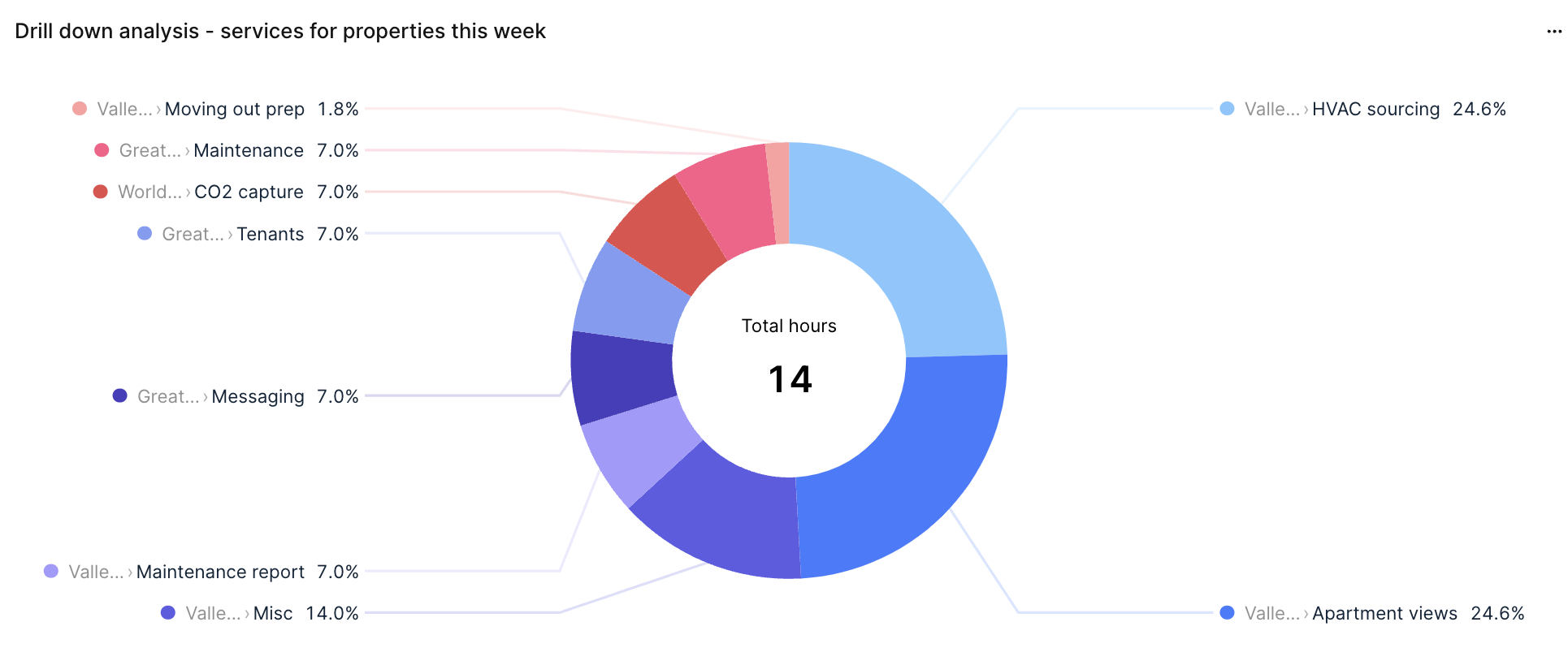
Visualize your calendar data in diverse ways by creating different types of charts. With a variety of chart options—pie chart, donut chart, heatmap, bar, area, and more—you can easily represent and analyze your event categories and metadata to gain deeper insights.
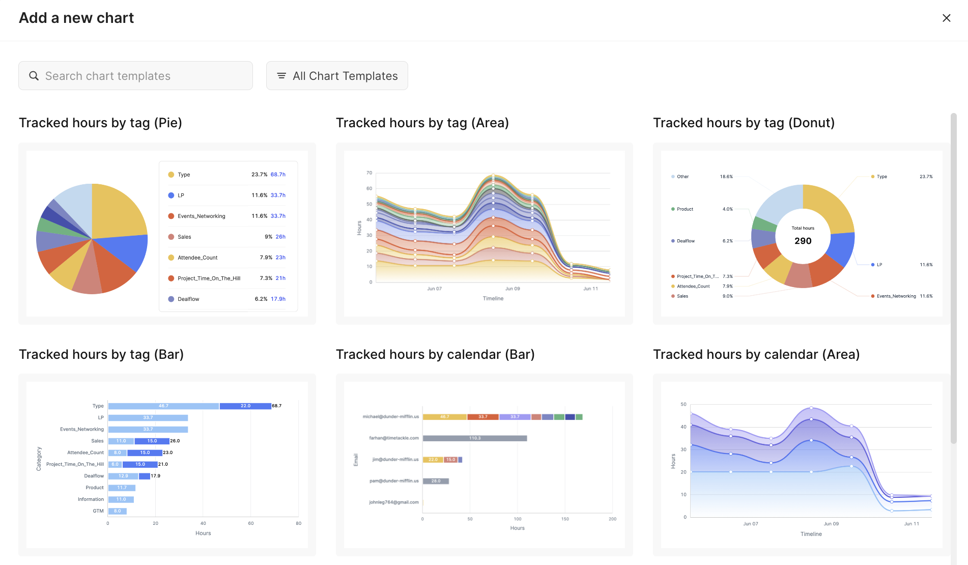
Visualize data from multiple calendar sources by creating charts with your properties as variables. Use various chart types, such as pie or donut charts, to gain full visibility of your team’s operations.
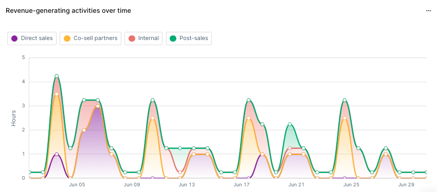
Build custom reports by select different data sources (individual or all calendar sources) and variables (custom properties). Utilize a variety of chart types to tailor your reports to your specific needs. Monitoring data reports helps you stay aligned with your goals and do reality check consistently.


Maximize potential: Tackle’s automated time tracking & insights