When you're managing a project, you're really asking one of two questions: are we tracking tasks on a simple timeline, or are we mapping out a complex web of dependencies? That’s the heart of the Gantt vs. PERT chart debate.
A Gantt chart is your go-to for tracking progress and keeping everyone on the same page for straightforward projects. On the other hand, a PERT chart is built for planning complex initiatives where the path forward is anything but certain.
Understanding the Core Difference
Picking the right chart isn't about which one is "better." It's about matching the tool to the job. Both Gantt and PERT charts give you a visual way to organize tasks, but they come at it from completely different angles. One is all about time and progress, while the other is focused on dependencies and big-picture strategy.
For a mid-sized agency or professional services firm, this choice can make or break your workflow. A simple marketing campaign with clear, sequential steps? A Gantt chart will do the trick perfectly. But for something like a complex software build with multiple, interconnected workstreams, the network view of a PERT chart is far more insightful.
Quick Comparison Gantt Chart vs PERT Chart
To get a feel for how they operate in the real world, it helps to see a quick side-by-side comparison. Think of this as a high-level cheat sheet before we dive deeper into their specific strengths and weaknesses.
| Attribute | Gantt Chart | PERT Chart |
|---|---|---|
| Primary Focus | Task scheduling and progress tracking | Dependency mapping and critical path analysis |
| Visual Style | Horizontal bar chart (timeline-based) | Network diagram (flowchart-style) |
| Best For | Simpler projects with defined tasks | Complex projects with uncertain timelines |
| Time Management | Displays precise start and end dates | Uses probabilistic time estimates |
| Main Function | Execution and monitoring | Strategic planning and risk assessment |
Seeing the core differences laid out like this makes it easier to understand where each tool shines.
The essential takeaway is that Gantt charts answer, "When will it be done?" while PERT charts answer, "What must be done first?" This distinction guides which tool you should select based on your project's primary challenge—scheduling or sequencing.
Getting these fundamentals down is the first step. Once you understand the structure, purpose, and ideal scenarios for each chart, your team can confidently pick the right tool for the job. This ensures your projects are not just well-planned, but successfully executed.
The Gantt Chart for Visual Project Timelines

At its heart, a Gantt chart is a simple, visual way to see a project’s entire timeline in one place. It takes all the complex moving parts of a project and lays them out using horizontal bars against a calendar. This design makes it incredibly easy to see how long each task should take and exactly when it’s supposed to start and end.
This visual clarity is the Gantt chart’s biggest advantage. You can get an immediate, at-a-glance feel for the project’s health—who’s doing what, and how far along they are. Because it's so linear, it’s the perfect fit for projects where the sequence of tasks is fairly predictable.
First cooked up by Henry L. Gantt around 1910, the Gantt chart has been a project management workhorse for over a century. Its staying power is undeniable. A 2020 survey revealed that 85% of project managers still count on Gantt charts as their go-to scheduling tool. It’s a testament to how well it displays durations, dependencies, and progress. You can read up on its long history over on its Wikipedia page.
Core Components and Functionality
A standard Gantt chart is made up of a few key pieces that come together to give you that bird's-eye view. Getting a handle on these components is the first step to using one effectively.
- Task List: This is your project breakdown, listed down the vertical axis. It’s everything that needs to get done.
- Timeline: Running along the horizontal axis, this represents the project's entire lifespan, usually marked in days, weeks, or months.
- Task Bars: These are the horizontal bars showing the start date, end date, and total time for each task.
- Dependencies: Often shown as lines or arrows connecting tasks, these signal that one task can’t start until another is finished.
- Progress: You'll often see shading inside a task bar to show how much of the work is done, giving you a real-time status check.
By pulling all these elements together, a Gantt chart becomes much more than a glorified to-do list. It's a living roadmap that shows you the critical connections between your time, your tasks, and your team.
This structure allows managers to map out the initial schedule and then keep a close eye on performance. To really nail this down, take a look at our guide on how to baseline a project. It's a crucial step for using Gantt charts to monitor how things are actually going versus how you planned.
A Practical Example in a Marketing Agency
Let's picture a digital marketing agency kicking off a new campaign for a client. The project manager would likely build a Gantt chart to map everything out, from the first bit of research to the final performance report.
The chart would make it obvious that "Task A" (keyword research) and "Task B" (competitor analysis) can happen at the same time, but "Task C" (content creation) can only start once "Task A" is complete.
This kind of visual cue is invaluable. It instantly tells the team what the priorities are and where potential delays might pop up, making the Gantt chart a must-have for keeping everyone in sync and clients in the loop.
The PERT Chart for Managing Project Complexity

When projects are full of unknowns, a simple timeline just doesn't cut it. This is where the PERT (Program Evaluation and Review Technique) chart really shines. It’s a network diagram built from the ground up to handle uncertainty and tangled dependencies.
Instead of the linear bars you see in a Gantt chart, a PERT chart looks more like a flowchart. It uses nodes to represent milestones and vectors (the lines connecting them) to represent the actual tasks required to get there.
This visual approach fundamentally shifts the conversation. It moves from "When will this be done?" to "What absolutely has to happen for us to move forward?" It forces teams to think critically about how tasks relate to one another, making it a powerful strategic planning tool, not just a daily tracker.
The PERT chart has a pretty impressive origin story. It was developed by the U.S. Navy back in 1958 for the Polaris missile program—a massive undertaking with thousands of contractors. This method is credited with cutting the project's completion time by 20%. Its legacy is still alive and well; one survey found that 45% of project managers in large organizations still pull out PERT charts for complex projects in sectors like IT and construction. You can see more on how these charts compare to Gantt charts on Replicon.com.
Key Concepts in PERT Planning
Unlike a Gantt chart's fixed dates, PERT operates on estimation and probability. It leans on a few core concepts to navigate projects where task durations are anyone's guess.
- Three-Point Estimation: For every single task, managers develop three time estimates: an optimistic (best-case scenario), pessimistic (worst-case), and most likely time. These are combined into a weighted average that accounts for potential risks right from the start.
- Critical Path Method (CPM): This is the heart of the PERT chart. It highlights the longest chain of dependent tasks, which ultimately determines the shortest possible time the entire project can be completed. If any task on this "critical path" gets delayed, the project's final deadline slips.
- Slack or Float: This is the wiggle room. It’s the amount of time a task can be delayed without messing up the next task or pushing back the overall project timeline. Knowing where you have slack is a huge advantage for allocating resources effectively.
By putting the critical path front and center, PERT charts give managers a crystal-clear view of which tasks are non-negotiable and which ones have a bit of flexibility. That insight is gold when it comes to prioritizing work and tackling risks before they blow up the project.
Example A New Software Implementation
Let's say your agency is implementing a new CRM system. A PERT chart would map out the whole process, showing you that data migration can’t even start until the system configuration is finished. In turn, team training can't kick off until that migration is a success.
This network view instantly flags the critical path. If data migration hits a snag and takes longer than expected, the training schedule and launch date are directly impacted. Understanding this helps the project manager swarm that critical task with the right resources to keep things on track.
For more advanced strategies on how to pull in timelines when you're in a crunch, check out our guide on crashing a project. This is what makes the PERT chart so indispensable for assessing risk in unpredictable project environments.
A Detailed Comparison of Gantt and PERT Charts

Picking the right project management chart isn't just about personal preference. It's a strategic call that dictates how your team plans, executes, and talks about their work. On one hand, you have the Gantt chart's linear, timeline-driven view. On the other, there's the PERT chart's non-linear, network-based perspective.
This single visual difference cascades into everything, defining their core strengths and where they shine. The whole Gantt chart vs PERT chart debate really comes down to this: tracking versus planning. Gantt charts are masters of tracking progress against a schedule, making them perfect for the execution phase. PERT charts, however, are built for upfront strategic planning, especially when you're staring down uncertain timelines and tangled dependencies.
Visual Representation and Core Function
The first thing you'll notice is how they look and what that means for their function. Gantt charts lay out tasks as horizontal bars on a calendar, a format that’s instantly familiar and easy to digest. This simplicity is gold when you need to show progress to clients or stakeholders who want a quick, clear status update.
PERT charts look completely different, using a flowchart of nodes and arrows to create a network diagram. The layout isn't about a strict timeline; it's about showing the logical sequence of events. Its main job is to help you find the critical path—the chain of tasks that dictates the project's minimum duration—before you've even started.
A Gantt chart is the superior choice for a client-facing progress report, where clarity and timelines are paramount. A PERT chart is the go-to tool for internal risk analysis before a project kickoff, where understanding dependencies is key.
Dependency Mapping and Uncertainty
Another key differentiator is how each chart handles the relationships between tasks. Gantt charts do a great job with simple, linear dependencies, like when Task B can't kick off until Task A is done. They show a clean, sequential flow that works perfectly for straightforward projects.
But what about more complex scenarios? That’s where PERT charts come in. They are built for projects with multifaceted dependencies, where several tasks might need to be completed before a single milestone is reached. They visualize the kind of complex relationships a simple timeline would just gloss over, giving you a much more realistic map of the workflow. This makes them far better at navigating uncertainty.
Situational Recommendations and Performance
So, which one should you choose? It really depends on the scale and complexity of your project. For a marketing agency running a predictable three-month social media campaign, a Gantt chart is perfect. It gives you the right level of detail for tracking weekly deliverables and keeping the client in the loop. The focus is squarely on execution and hitting deadlines.
Now, imagine an IT firm developing a new software application. You've got tons of interdependent modules, and development times are anyone's guess. Here, a PERT chart is non-negotiable. It lets the project manager model different outcomes, spot high-risk dependencies early, and shift resources to protect that critical path.
This isn't just theory. Research analyzing 1,200 projects found that for smaller, simpler projects, those using Gantt charts had a 15% higher rate of on-time completion. For large, complex initiatives, PERT charts led to a 22% higher success rate. You can explore more project management insights about these findings.
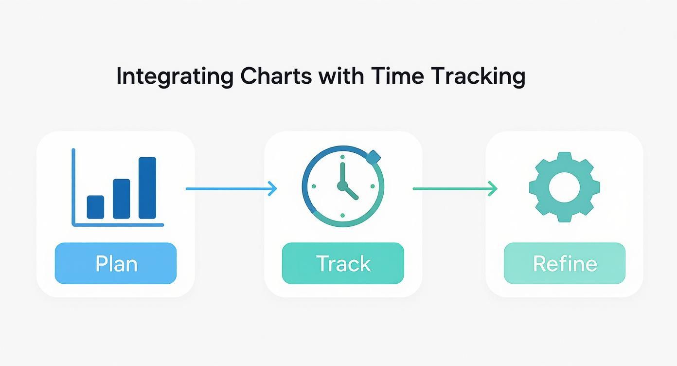
Integrating Planning Charts with Time Tracking
A project plan, whether it's a Gantt or PERT chart, is really just a forecast. It's your best guess. To turn those static plans into a dynamic, data-driven management tool, you have to connect them to what’s actually happening on the ground. That’s where a solid time tracking system comes in.
This connection transforms your project chart from a simple roadmap into a live dashboard. When your team logs their hours, that data can automatically feed back into the plan. Suddenly, a task you estimated at 40 hours shows it's 50% complete once 20 hours are tracked against it. You're no longer guessing at progress; you're measuring it.
Turning Data into Decisions
This feedback loop does more than just update a few progress bars—it fuels smarter resource allocation. By comparing the planned effort against the actual time your team is spending, you can spot scope creep or bottlenecks before they derail the project. If a task consistently chews up more hours than you planned, you have the data to adjust future sprints or have a frank conversation with the client.
This process highlights the crucial link between effective project management and time tracking, demonstrating how one constantly informs the other. Instead of relying on gut feelings or subjective status updates, you’re making decisions based on cold, hard facts. This is fundamental, whether your team is still in the Gantt chart vs PERT chart debate or deep into executing the chosen plan.
This integration creates a powerful source of truth. When actual time data continuously refines the project plan, you build more accurate forecasts, improve team utilization, and ultimately protect your agency’s profitability.
Streamlining Workflows and Reporting
Automating this connection also cuts out a massive amount of administrative work. Manually updating charts is a time-suck and a recipe for human error. An integrated system handles that for you, freeing up your project managers to focus on strategy instead of tedious data entry.
Better yet, this real-time data makes client reporting incredibly efficient and transparent. You can generate accurate, up-to-the-minute reports showing exactly where their budget and your team's time are going. This level of detail builds trust and gives you a clear justification for billing, turning your project tools into a powerful communication asset. Ultimately, it helps create a more profitable and predictable operational model for your firm.
Making the Right Choice for Your Project
Here’s a little secret from the field: choosing between a Gantt and a PERT chart often isn't an either/or decision. The savviest firms I’ve worked with actually use both, just at different stages of a project. It’s a hybrid approach that lets them play to the strengths of each tool.
Many agencies kick things off with a PERT chart right at the beginning, during that initial strategic phase. Its network diagram is perfect for mapping out all those complex dependencies, figuring out the critical path, and spotting potential roadblocks before you've even committed to a timeline. Think of it as building a resilient foundation for the project.
From Strategic Plan to Daily Execution
Once that strategic groundwork is laid with a PERT chart, the plan gets translated into a Gantt chart. This is where the focus shifts from high-level "what-ifs" to day-to-day execution. The Gantt chart’s simple, timeline-based view is exactly what you need for assigning tasks, checking progress, and keeping both the team and the client in the loop on schedules.
At the end of the day, the Gantt chart vs PERT chart debate is entirely situational. The best tool—or combination of tools—really comes down to your project's complexity, your team's workflow, and what your client needs to see.
This simple workflow shows how you can integrate your charts with real-world performance data.
It’s a straightforward but powerful loop: create your plan, track the actual time and effort against it, and then use that data to refine your next steps. When you’re thoughtful about which chart to use and when, you give your team the clarity and accountability they need to deliver successful projects every single time.
Answering Your Key Questions
When you're weighing Gantt vs. PERT charts, a few questions always seem to pop up. Let's clear the air so you can pick the right tool and get your team and clients on the same page.
Can You Really Use Gantt and PERT Charts Together?
Absolutely. In fact, some of the most successful agencies I've worked with do just that. They start with a PERT chart in the messy, early stages to figure out all the complex dependencies and nail down the critical path. Think of it as their strategic blueprint.
Once that high-level plan is solid, they translate it into a Gantt chart. This becomes the day-to-day guide for execution, tracking progress, and keeping stakeholders in the loop. It’s a hybrid approach that gives you the best of both worlds: PERT’s strategic clarity and Gantt’s tactical control.
Which Chart Is Better for Talking to Clients?
When it comes to client communication, the Gantt chart wins, hands down. Its straightforward, timeline-based layout is something anyone can understand in a few seconds. Clients don’t need a course in project management to see start dates, end dates, and how things are progressing.
A PERT chart is an internal kitchen—it's messy and focused on how the sausage gets made. A Gantt chart is the finished meal you present to the client, showing them exactly what to expect and when. It builds confidence and keeps everyone aligned.
How Does Modern Software Handle Both of These?
This is where things get interesting. Most modern project management tools have blurred the lines. While the main interface usually looks like a Gantt chart, many of them have PERT-like logic running under the hood. For instance, the software can automatically flag your critical path or let you build complex task dependencies that go way beyond a simple "finish this, then start that."
What this really means is you don't always have to make a hard choice between the two. The software does the heavy lifting of managing dependencies (the PERT part) while giving you a clean, intuitive timeline (the Gantt part) to actually manage the project.
Stop guessing and start knowing. Connect your project plans to reality by automating your progress tracking with TimeTackle. It pulls data directly from your team's calendar events, giving you a live look at utilization and project health without anyone having to fill out a timesheet. See how it works at https://www.timetackle.com.