When you're trying to choose between a Gantt and a PERT chart, it really boils down to one key difference. Gantt charts are fantastic for seeing a project's schedule and tracking progress, while PERT charts are built to handle complex dependencies and uncertainty.
Think of it this way: use a Gantt chart when you need a clear visual timeline for a straightforward project. On the other hand, a PERT chart is your go-to for mapping out tricky task relationships in projects that are anything but linear.
Understanding Gantt and PERT Charts
At their core, both Gantt and PERT charts are classic project management tools, each designed to bring a little order to the chaos. They help managers plan, schedule, and see a project through by breaking big goals into smaller, more manageable pieces.
But here's where they diverge. They come at this challenge from completely different angles, a direct result of their unique origins and the problems they were originally designed to solve.
A Gantt chart, first developed by Henry Gantt way back in 1910, is essentially a horizontal bar chart. It gives you an intuitive, at-a-glance picture of your project's entire lifecycle set against a calendar. Each bar is a task, and its length shows how long that task will take. This visual simplicity is perfect for showing progress to stakeholders and managing workloads.
Then you have the PERT (Program Evaluation and Review Technique) chart. This one was born in the U.S. Navy during the 1950s to help manage incredibly complex weapons projects. It works like a network diagram, using nodes and arrows to map out how different tasks depend on one another. Its real power is in managing projects full of unknowns, where understanding the web of dependencies is far more important than just looking at a timeline.
To make the Gantt vs PERT chart choice clearer, here’s a quick side-by-side look:
| Aspect | Gantt Chart | PERT Chart |
|---|---|---|
| Primary Focus | Project timeline and task schedule | Task dependencies and critical path |
| Best For | Simple, sequential projects with clear timelines | Complex, uncertain, or R&D projects |
| Visual Style | Horizontal bar chart against a calendar | Network flow diagram showing relationships |
| Time Estimation | Uses single, fixed time estimates for tasks | Uses three-point estimates (optimistic, pessimistic, most likely) |
Different Origins for Different Problems
The Gantt chart was created to solve efficiency problems on the factory floor. The goal was to answer a simple question: "Are we on schedule?" This sharp focus on time and progress is why it’s still the default tool for things like construction, event planning, and software release schedules—projects where the steps are well-defined. In fact, effective project management and time tracking almost always lean on the clarity a Gantt chart brings to the table.
The PERT chart, however, was developed to wrangle the Polaris missile project, a massive initiative involving thousands of contractors and technology that hadn't even been invented yet. Its job wasn't just to schedule tasks, but to analyze risk and pinpoint the critical path—the longest chain of dependent tasks that ultimately dictates the project's minimum completion time.
A simple way to remember the difference is that a Gantt chart tells you what happens and when, while a PERT chart explains how tasks are connected and why one must finish before another can begin.
Getting a handle on these foundational differences is the first step. It equips you to pick the right tool that actually fits what your team needs to accomplish.
How Gantt Charts Visualize Project Timelines

At its core, a Gantt chart is a special kind of horizontal bar chart that turns a laundry list of project tasks into a clear, visual story. It maps out the entire project lifecycle against a calendar, giving anyone an immediate, at-a-glance understanding of what needs to happen and when.
Each horizontal bar you see represents a single task, and its length directly corresponds to how long that task is expected to take. The vertical axis lists all the project activities, while the horizontal axis simply represents time—whether in days, weeks, or months.
This straightforward structure is the Gantt chart’s greatest strength. It’s the perfect tool for communicating progress to stakeholders who just need a quick overview without getting bogged down in the nitty-gritty details. It instantly answers the essential questions: who is doing what, and by when?
The Core Components of a Gantt Chart
The real magic of a Gantt chart is how it layers multiple pieces of information into a single, easy-to-digest view. A few key elements work together to create this clarity:
- Task Bars: These are the building blocks, representing each job to be done and showing its start and end dates.
- Dependencies: You'll often see arrows or lines connecting tasks. These show which activities must be finished before others can kick off.
- Milestones: Usually marked as diamonds, these highlight significant events or project phases, like a product launch or a key approval.
- Progress Indicators: Bars can be shaded to show how much of a task is complete, offering a real-time status update right on the chart.
This visual format is fantastic for managing resource workloads and keeping an eye on key deliverables. It’s a classic for a reason. Developed by Henry L. Gantt way back in the 1910s, it completely changed the game for project management.
And its relevance hasn't faded one bit. A 2022 report from the Project Management Institute (PMI) found that 68% of projects globally still rely on Gantt charts to coordinate team efforts and visualize their timelines.
The true power of a Gantt chart lies in its ability to make time tangible. It takes abstract deadlines and transforms them into a concrete, shared roadmap that keeps the entire team aligned and moving forward.
For projects where timing and sequence are everything, the Gantt chart remains the go-to tool. It provides a transparent framework that helps everyone understand their role and how their work fits into the bigger picture. To get a deeper dive into its capabilities, check out this guide on Gantt Charts for Seamless Project Management. When you're weighing a Gantt vs PERT chart, remember that the Gantt chart’s strength is its unmatched clarity for scheduling and tracking progress.
How PERT Charts Map Complex Dependencies

While a Gantt chart gives you a clear, linear timeline, a PERT chart is built for navigating the unknown. Think of it as a network diagram, mapping out the tangled web of task relationships that always pop up in complex projects. This makes it an absolute lifesaver when the path forward is anything but certain.
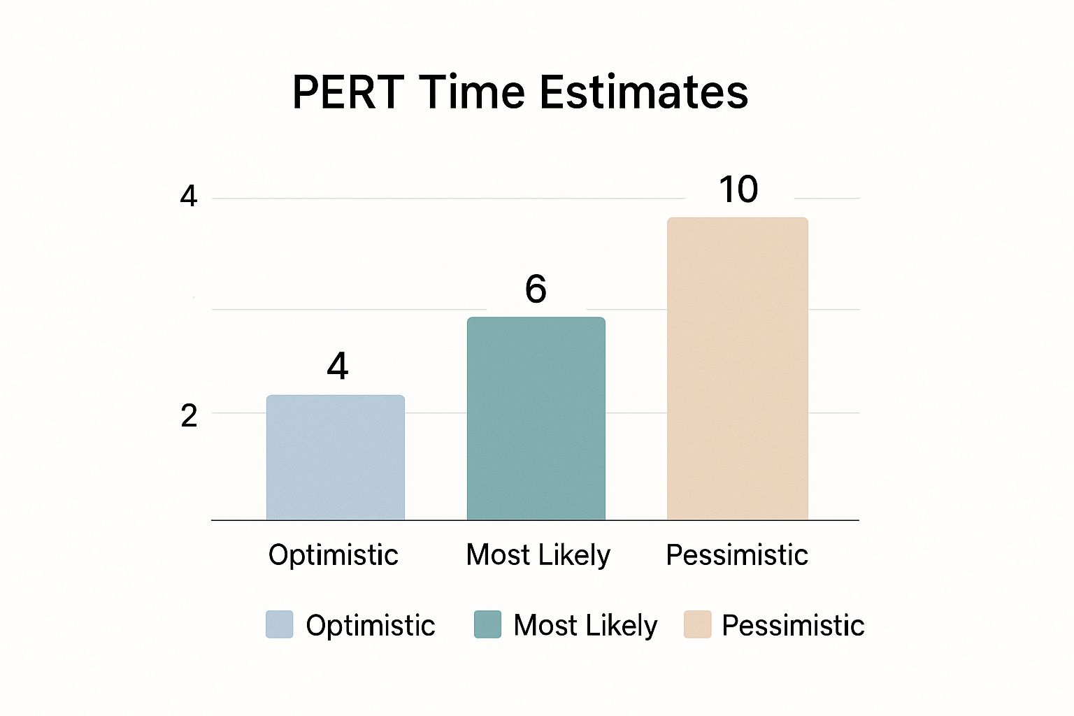
The real magic behind PERT is its three-point estimation technique. Instead of locking you into a single, often unrealistic, time estimate, this approach forces you to consider a range of outcomes. The result is a weighted average that accounts for both best-case scenarios and potential roadblocks.
Three-Point Estimation Explained
This probabilistic approach is what truly separates PERT from the pack. It’s not just about scheduling; it’s about actively managing uncertainty. The technique relies on three distinct estimates:
- Optimistic (O): The absolute best-case scenario. Everything goes right, and there are zero delays.
- Pessimistic (P): The worst-case scenario. Murphy's Law is in full effect, and significant issues crop up.
- Most Likely (M): The most realistic guess, based on typical conditions and available resources.
With these three data points, a project manager can calculate a much more defensible expected duration for any given task. This kind of analysis is non-negotiable for innovative R&D projects or massive engineering efforts where setting a firm deadline from day one is just wishful thinking.
The PERT chart’s real value comes from its ability to answer "what if" questions. By visualizing every dependency and using weighted time estimates, it shows teams precisely how a delay in one tiny task could snowball and derail the entire project.
Identifying the Critical Path
Ultimately, the goal of any PERT analysis is to find the critical path. This is the longest chain of dependent tasks that dictates the absolute minimum time your project will take. If any task on this path gets delayed, your final delivery date gets pushed back—no exceptions.
The Program Evaluation and Review Technique, or PERT, was born out of necessity back in 1958, developed by the U.S. Navy and Lockheed Martin to manage impossibly complex submarine missile projects. Unlike Gantt charts, PERT is laser-focused on illustrating task dependencies with network nodes to perform rigorous critical path analysis. Even today, an estimated 25-30% of complex projects in sectors like aerospace and construction still rely on PERT for their planning. You can explore more on this topic by checking out additional insights on Creately.com.
This deep focus on dependencies makes the PERT chart a powerful strategic tool. In the Gantt vs. PERT chart debate, PERT is the hands-down winner when understanding the why behind your timeline is more important than just tracking its when.
Comparing Key Differences Between Gantt and PERT
At first glance, Gantt and PERT charts might seem like two sides of the same coin, but their fundamental difference comes down to one question: are you focused on the when or the why?
Gantt charts are the masters of the schedule. They give you a clear, visual answer to when tasks will happen. PERT charts, on the other hand, are all about mapping dependencies—explaining why certain tasks must happen in a specific order before others can even begin. This core distinction shapes everything from how they look to how they handle time.
Visual Structure and Readability
The most obvious difference is how they look. A Gantt chart is your classic horizontal bar chart. It’s clean, linear, and instantly understandable, even for people who've never seen one before. This straightforward design makes it the go-to choice for communicating with stakeholders who just want to know two things: what's the progress, and are we on track to hit our deadline?
A PERT chart is a different beast entirely. It’s a network diagram, a web of nodes (tasks) and arrows (dependencies) that maps out the project's internal logic. While incredibly powerful for a project manager digging into the nitty-gritty, it can look like a confusing flowchart to team members or clients. Its main job isn't to show a simple timeline; it's to reveal the complex relationships between tasks.
Approach to Time Management
This is where the two really diverge. Gantt charts generally work with single-point estimates. You assign a fixed duration to each task, which is perfect for projects where the work is predictable. Think of a marketing agency that knows from experience that writing ad copy takes three days, period.
PERT charts were built for the unknown. They use a three-point estimation technique to create a weighted average, forcing you to think through the possibilities. For each task, you come up with three estimates:
- Optimistic: The absolute best-case scenario if everything goes perfectly.
- Pessimistic: The worst-case scenario where Murphy's Law is in full effect.
- Most Likely: The realistic timeline, assuming a normal set of circumstances.
This method gives you a much more nuanced and statistically sound forecast for projects filled with uncertainty.
This infographic shows how PERT's three time estimates create a more realistic forecast for uncertain tasks.
By factoring in the best, worst, and most likely outcomes, project managers can build a timeline that’s prepared for reality, making PERT a far better fit for R&D or any innovative work where durations are just educated guesses.
The core tradeoff is simple: Gantt charts offer clarity and simplicity for known timelines, while PERT charts provide analytical depth and risk assessment for unknown timelines.
Complexity and Dependency Mapping
When your project is a tangled web of interconnected tasks, the PERT chart is the undisputed champion. Its entire structure is designed to map and analyze complex dependencies, allowing project managers to identify the critical path—the one sequence of tasks that absolutely cannot be delayed without pushing back the entire project deadline.
Take pharmaceutical drug development, for example. A delay in a single clinical trial can trigger a massive domino effect on regulatory submissions and manufacturing schedules. A PERT chart puts these high-stakes connections front and center. You simply can't ignore them.
A Gantt chart can show basic dependencies with linking arrows, but in a project with dozens of non-linear workflows, it quickly becomes a cluttered mess. Its real strength lies in managing sequential, predictable tasks, not a complex network of moving parts.
To make the comparison even clearer, let's break down the key features of each tool side-by-side. This table offers a direct look at where each one shines.
Gantt vs PERT Chart: A Detailed Feature Breakdown
| Feature | Gantt Chart | PERT Chart |
|---|---|---|
| Primary Purpose | Scheduling and progress tracking | Planning and dependency analysis |
| Visual Format | Horizontal bar chart (timeline-based) | Network diagram (flowchart-based) |
| Time Estimation | Single-point estimate (fixed duration) | Three-point estimate (optimistic, pessimistic, most likely) |
| Best For | Simple, predictable projects with clear timelines | Complex, uncertain projects with many dependencies |
| Readability | High; easy for all stakeholders to understand | Low; requires training to interpret correctly |
| Dependency Focus | Shows basic sequential dependencies | Maps complex, non-linear dependencies in detail |
| Key Output | A clear project timeline and progress view | Identification of the critical path and potential risks |
This breakdown should help you see that the choice isn't about which chart is "better," but which one is the right tool for the specific job you're facing.
When To Choose a Gantt vs PERT Chart
So, how do you decide between a Gantt chart and a PERT chart? This isn't just about picking a visual tool; it's about choosing the right management philosophy for the specific project you're facing. Your decision really comes down to one question: does your project demand a clear, predictable schedule, or do you need a deeper analysis of complex, interconnected tasks?
Think of it like choosing between a detailed road map and a strategic GPS. A road map (the Gantt chart) is perfect when you know the route. But a GPS (the PERT chart) is what you need when you have to navigate unpredictable traffic and find the absolute fastest path.
Opt for a Gantt Chart for Clarity and Control
The Gantt chart is your go-to when you're dealing with well-defined tasks, hard deadlines, and the need for straightforward stakeholder reporting. It really shines when predictability and visualizing a timeline are your biggest concerns.
You should choose a Gantt chart when:
- Your project is linear and sequential. If tasks follow a logical, step-by-step flow, like in construction or event planning, the Gantt chart is a natural fit.
- Stakeholder communication is a top priority. Its simple bar chart format is almost universally understood. This makes it perfect for sharing progress updates without getting bogged down in technical details.
- Your timelines are relatively fixed. You have solid estimates for how long each task should take and your main job is to track progress against that baseline.
There’s a reason Gantt charts are so common in the execution phase of projects—they're used by roughly 75% of project teams around the world. A big driver for this is accessibility; an estimated 88% of project management software platforms include Gantt functionality right out of the box. If you want to see how different modern tools handle this, our guide on Microsoft Project vs Trello provides some great context.
Select a PERT Chart for Complexity and Uncertainty
On the flip side, a PERT chart becomes absolutely essential when you're managing high-risk projects with tons of dependencies and uncertain task timelines. It's the better tool when understanding the "what-ifs" is far more important than just plotting dates on a calendar.
A PERT chart is necessary when:
- The project is complex and non-linear. Think R&D projects, new technology development, or huge system integrations where every task is tangled up with several others.
- Task durations are up in the air. The three-point estimation technique is a game-changer here, giving you a more realistic timeline by factoring in optimistic, pessimistic, and most likely scenarios.
- Finding the critical path is everything. If your primary goal is to identify the exact sequence of tasks that could delay the entire project, the PERT chart is designed for that.
The choice really boils down to this: A Gantt chart manages the schedule, while a PERT chart analyzes the strategy. Use a Gantt to show what will happen and when. Use a PERT to understand how it all connects and why.
As you weigh your options, don't forget to look at other frameworks. For instance, Kanban board project management offers another way to visualize workflows, especially in more agile settings. By carefully looking at your project's complexity and who you need to communicate with, you can pick the chart that truly lines up with your goals.
Using Gantt and PERT Together for Better Results

Here's a common misconception: you have to choose either a Gantt chart or a PERT chart. The truth is, the sharpest project managers I know rarely pick just one. They use both, playing to the strengths of each tool at different points in the project.
Think of it as a one-two punch. You get the deep analytical power of PERT for planning and the straightforward visual tracking of Gantt for execution.
It all starts with the PERT chart right at the beginning, during the initial planning phase. For any complex project with a web of interconnected tasks, PERT is your go-to for mapping out dependencies and sniffing out the critical path. Using its three-point estimation, you can build a far more realistic timeline that actually accounts for uncertainty. This is how you build a solid foundation.
Translating Strategy Into Action
Once you've got that strategic groundwork locked in with PERT, you translate those insights into a Gantt chart. This is where you shift from planning the what and why to scheduling the when. The Gantt chart becomes the team's daily playbook.
This is the tool your team will look at every day for:
- Visualizing the schedule on a simple calendar timeline.
- Assigning resources to every single task.
- Tracking progress with those satisfying, color-coded bars.
By leaning on PERT for strategic planning and Gantt for tactical execution, you really do get the best of both worlds. You get the analytical rigor to create a bulletproof plan and the visual simplicity to keep everyone on the same page.
This hybrid approach is a game-changer for getting complex projects over the finish line. Of course, the right methods only work with the right tools. Pairing this strategy with solid software is key, and you can learn more about efficient resource management with Smartsheet time tracking to round out your toolkit.
Common Questions About Gantt and PERT Charts
Even after you get the basics down, you’ll probably have a few practical questions when you're weighing a Gantt vs. PERT chart. Getting these common points of confusion cleared up will help you lock in which approach is right for your project.
Can I Use a Gantt Chart for a Complex Project?
You absolutely can, but you need to know its limits. Gantt charts are perfectly capable of handling complex projects, especially when the tasks are well-defined and mostly sequential. Modern project management software lets you track hundreds of tasks and their dependencies without much trouble.
Where they start to fall apart, though, is with really tangled, non-linear relationships. If your project has a ton of interconnected tasks that don't follow a simple A-then-B flow, the Gantt chart can turn into a confusing web of dependency lines. At that point, it loses its main benefit: clarity.
For projects with a web of dependencies, try using a PERT chart for the initial planning. It helps you map out the critical path and understand the connections first. Once you have that blueprint, you can translate it into a Gantt chart for day-to-day tracking and execution.
Is PERT the Same as the Critical Path Method?
Good question. They’re not the same, but they are very closely related and almost always used together. Think of them as two sides of the same coin.
The Program Evaluation and Review Technique (PERT) is all about estimating project timelines when there's a lot of uncertainty. Its signature move is the three-point time estimate: optimistic, pessimistic, and most likely. This gives you a probable duration, not a fixed one.
The Critical Path Method (CPM), on the other hand, is the algorithm that finds the longest sequence of dependent tasks. That sequence determines the absolute minimum time your project will take. CPM is deterministic (it works with fixed times), while PERT is probabilistic. In the real world, CPM is often the engine that powers the analysis within a PERT framework.
Which Chart Is Better for Agile Projects?
To be perfectly honest, neither Gantt nor PERT charts are a natural fit for agile. Agile teams thrive on flexibility, iteration, and responding to change, so they gravitate toward tools like Kanban or Scrum boards that visualize work in short, dynamic cycles.
That said, a simplified Gantt chart can still have a place. It's often used to map out high-level product roadmaps or visualize release schedules without getting bogged down in task-level details.
PERT charts, however, really don't jive with the agile mindset. Their heavy emphasis on detailed, upfront planning goes against the core agile principle of adapting to change over sticking to a rigid plan.
Ready to move beyond manual tracking and gain automated insights into your team's productivity? TimeTackle transforms your calendar data into a powerful analytics tool, helping you understand resource utilization, project ROI, and operational efficiency without the hassle of timesheets. Learn how TimeTackle can streamline your reporting today.