

Friday afternoon is when the old system usually breaks.
A partner asks where the week went. A project lead opens a spreadsheet. Someone scrolls through email, Slack, and calendar invites, trying to remember whether that client call lasted twenty minutes or closer to forty. Then the rounding starts. A short review becomes 0.1. A stop-start drafting session turns into a single block. By the time the invoice goes out, the firm has data, but not clean data.
That’s why the phrase attorney billing chart still gets searched so often. It points to a real need. People want a fast way to convert work into billable time without doing math by hand. The problem is that the classic chart solves only the smallest part of the job. It helps with increments. It doesn’t fix memory, consistency, or reporting.
I’ve seen the same pattern far beyond legal teams. Marketing agencies, consulting groups, accounting teams, implementation firms, and financial service businesses all deal with the same mess. Billable work happens across meetings, prep, follow-ups, research, revisions, and internal reviews. If those activities live in separate tools and someone records them later, the record is always incomplete.
More than just a lawyer’s tool
Monday starts with a client call at 9:00, a draft review at 10:30, two quick Slack approvals before lunch, and a status meeting that runs long. By Friday, someone still has to turn that scattered week into billable time. That is why the idea behind an attorney billing chart keeps showing up outside law firms.
A billing chart may have started as a legal tool, but the operating problem is broader. Agencies, consultants, accountants, and other professional service teams all need a consistent way to convert work into billable entries. The labels change by industry. The underlying friction does not.

Traditional billing chart content usually stops at the conversion table. It explains how to turn minutes into tenths and leaves the harder issue untouched. Firms do not lose accuracy because they cannot do the math. They lose accuracy because the record of work is spread across calendars, email, project tools, chat, and memory.
That distinction matters in practice. A lawyer logging a client call, an agency account lead reviewing creative, and a consultant splitting time between delivery and internal planning all face the same trade-off. Manual reconstruction is familiar and cheap to start. It is also inconsistent, hard to audit, and weak as a reporting system once the team grows.
Why manual recall breaks down
People miss time because the day is fragmented, not because they lack discipline.
A calendar usually captures the visible parts of client work. The follow-up does not always live there. Neither do the fifteen-minute review, the quick approval call, the research block between meetings, or the admin work tied to delivery. Those small gaps are exactly where billing records become thin.
When someone fills out a spreadsheet later in the day or week, they are rebuilding the story after the fact. Some entries get rounded. Others get grouped together. Internal and client-facing work blur. The result may still produce an invoice, but it does not produce reliable operational data.
The core problem is delayed capture.
Why this matters outside law firms
Legal teams gave the market the language of billable increments, but the better lesson is operational discipline. Other service businesses need that same discipline without relying on static charts and end-of-week memory.
That is why firms looking for an attorney billing chart are often looking for a better system, even if they do not phrase it that way. Tools built for time tracking software for lawyers reflect a broader shift across professional services. The strongest setups start with the calendar and other work signals the team already uses, then turn that activity into billing records people can review, correct, and report on.
That approach keeps the useful part of the old chart. It gives firms a consistent billing structure. It also fixes what spreadsheets never handled well: timely capture, cleaner detail, and reporting that holds up beyond invoicing.
The anatomy of a traditional billing chart
A partner asks for draft bills at 4:30 p.m. The work got done, but three people are still reconstructing their day from email, call notes, and memory. That is the primary job of a traditional billing chart. It is not just a reference table. It is the framework firms use to turn scattered activity into billable time after the fact.
In law firms, that framework usually centers on the six-minute increment, or 0.1 hour. The reason is practical. Minute-by-minute tracking is tedious in a manual process, while larger increments create more rounding disputes and more client pushback. The chart gave legal teams a common standard, and other professional service firms adopted the same logic because the operational problem is identical. People do fragmented work, switch contexts all day, and still need a billable record that finance can use.
The core unit is tenths of an hour
The familiar chart usually works like this:
| Minutes worked | Billable time |
|---|---|
| 1 to 6 | 0.1 |
| 7 to 12 | 0.2 |
| 13 to 18 | 0.3 |
| 19 to 24 | 0.4 |
| 25 to 30 | 0.5 |
The appeal is obvious. A lawyer, paralegal, accountant, consultant, or agency lead can record time quickly without calculating fractions from scratch. On a whiteboard, it looks efficient and fair.
Operations teams know where it breaks.
Short tasks get rounded. Split attention disappears into a single block. Work entered late gets simplified because people remember the outcome better than the sequence. The chart does not create those behaviors, but it gives them a standard format.
A usable chart needs more than time increments
The time conversion table is only one layer. The entries around it determine whether the record holds up in billing review, client scrutiny, and internal reporting.
A workable chart system usually requires these fields:
- Client or matter reference: so time is assigned correctly
- Task description: enough detail to justify the charge
- Billing status: billable, non-billable, internal, or no-charge
- Rate context: standard rate, custom rate, or approved override
Practical rule: If a client would question the entry a month later, the record is incomplete.
That standard applies well beyond legal billing. Agencies need it for retainers and project work. Consultancies need it for utilization and margin analysis. Accounting firms need it during busy periods when dozens of short tasks blur together. The legal version came first, but the weakness of the old model is the same across professional services. Static charts depend too much on delayed entry.
Where the old model starts leaking
The legal field has documented that weakness clearly. Lawyers typically bill only 30% to 40% of their total working hours, with an average utilization rate of 37%, according to Clio’s analysis of billable hours and utilization (https://www.clio.com/blog/billable-hours-chart/). The 70% minimum suggested by the Association of Legal Administrators sets a very different benchmark (https://www.alanet.org/).
Clio also found that 48% of the workday often goes to administrative tasks. That number matters because manual chart systems add more administrative work at the close of the workday, exactly when people are least likely to capture detail accurately.
In firms still relying on spreadsheets or manual entry, the same patterns show up repeatedly:
- Backfilled entries: work is recorded from memory instead of from live activity
- Block billing: several distinct actions collapse into one vague line
- Review friction: finance teams and approving partners spend extra time cleaning narratives
- Lost context: the entry shows duration, but not the sequence, interruption, or related calendar activity
I have seen firms defend the chart because it creates order, and that part is true. It gives teams a shared billing language. What it does not give them is timely capture or reliable operational visibility.
That is the trade-off. Traditional billing charts helped standardize timekeeping, especially in legal practice. Modern firms need more than a chart. They need a system that starts with actual work signals, especially the calendar, and turns those signals into reviewable billing records before memory starts doing the editing.
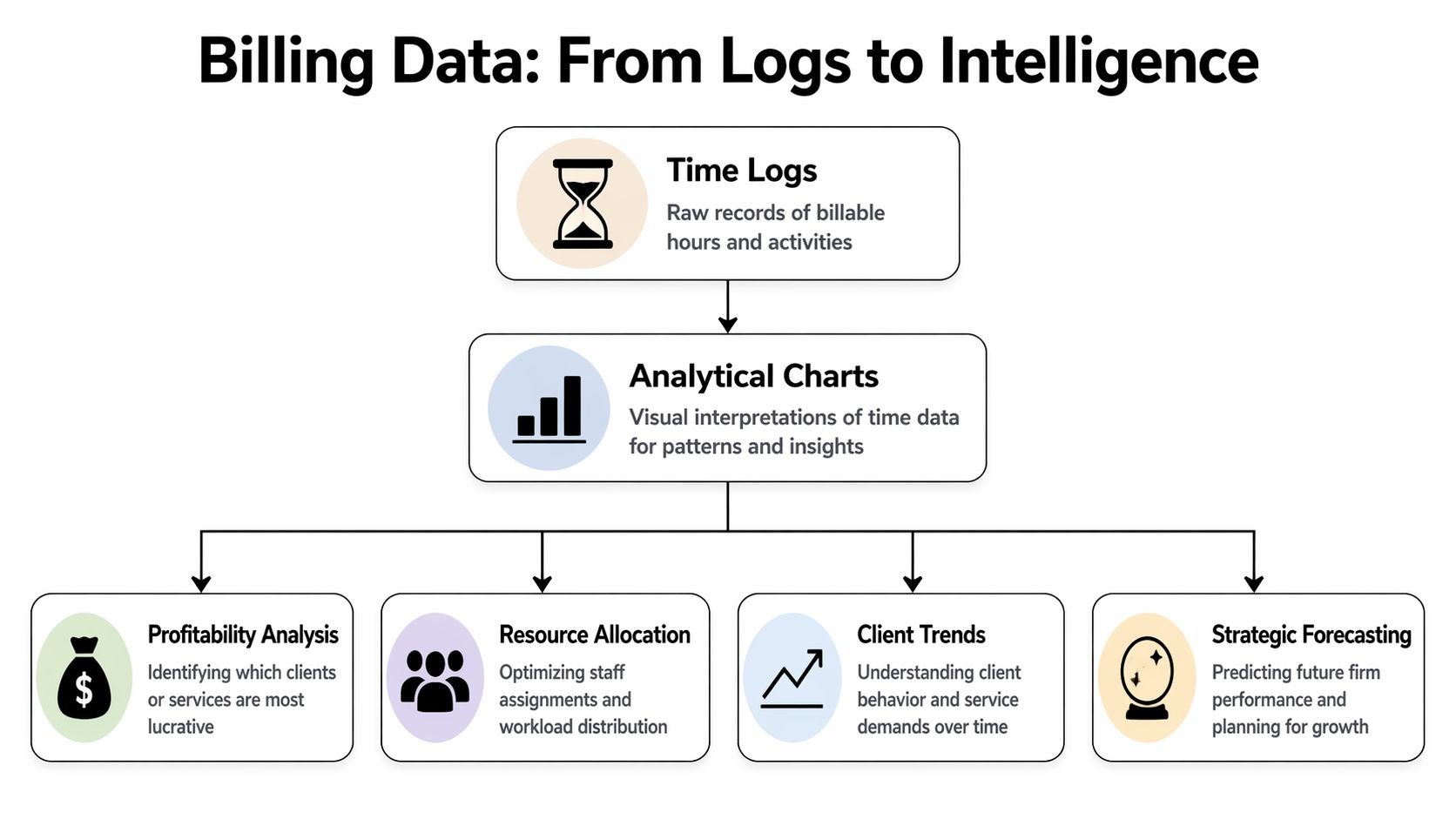
Going beyond time logs with analytical charts
A billing chart earns its keep when it helps a firm make decisions before margin slips, invoices stall, or staff time gets misallocated. A simple time log cannot do that on its own. It records hours. An analytical chart shows pricing pressure, workload imbalance, collection risk, and the places where process failure keeps repeating.
This matters beyond legal practice. Law firms gave the billing chart its name, but the same operational problem shows up in agencies, consultancies, accounting firms, and any team that sells time. Once the business depends on billable hours, leaders need more than a ledger of what happened. They need reporting that shows whether the work was priced correctly, staffed correctly, and converted into cash on time.
Rate tables show pricing reality
Start with rates. Every professional services firm should have a current chart that shows billing rates by person, role, client, and matter or project type.
That chart answers practical questions quickly.
| Question | What the chart should show |
|---|---|
| Are we charging the same client consistently? | Standard vs overridden rates |
| Are some roles underpriced? | Rate by title or service line |
| Are blended engagements drifting? | Average effective rate by account |
| Are discounts becoming routine? | Frequency of exceptions |
A rate chart matters because firms rarely lose margin in one dramatic event. They lose it through small exceptions that become habit. A partner gives a discount to close a client. A project manager keeps using the old rate card. Finance cleans it up later, but by then the pattern is already in the system.
For legal teams, that may show up as matter-specific overrides. For agencies or consulting firms, it often appears in blended retainers, unreviewed scope changes, or senior staff doing work priced for junior roles. The chart is the same. Only the labels change.
Utilization reports show where capacity and margin drift apart
Utilization charts should do more than rank people by hours. They should show whether the firm is using expensive talent on the right work and whether internal demands are swallowing billable capacity.
I look for utilization by role, team, client mix, and time category. A single average hides too much. Two people can each be at the same utilization level for completely different reasons. One may be overloaded with low-value client admin. Another may be spending half the week on internal approvals, recruiting, or rework caused by poor handoffs.
That distinction matters. The fix for underutilization is not always more client work. Sometimes it is better delegation, cleaner process, or fewer manual billing steps.
A utilization chart is also one of the clearest ways to compare traditional timekeeping with a calendar-based system. Manual entries usually show the hours someone remembered to enter. Calendar-linked reporting shows how the day was structured, including meetings, context switching, and recurring blocks that keep crowding out billable work.
WIP and aging charts show where revenue slows down
Hours recorded do not equal revenue collected. Firms that live in spreadsheets learn this the hard way.
A work in progress chart shows time that has been captured but not yet billed. An aging chart shows invoices that were sent but not paid. Together, they reveal where revenue starts to stall.
The questions are straightforward:
- Is recorded work sitting too long before invoicing?
- Which clients consistently delay approval or payment?
- Are certain managers or partners creating billing bottlenecks?
- Do reductions happen before the invoice goes out or after the client pushes back?
These charts are especially useful for firms outside legal, because many agencies and consultancies still assume cash flow problems start in accounts receivable. Often the delay started earlier, when time stayed in draft form, approvals dragged on, or nobody noticed that meetings filled the calendar while billable entries lagged behind.
Write-off analysis shows where the process breaks
Write-offs deserve their own chart because they usually point to a recurring operational issue, not a one-off billing dispute.
The pattern may be vague narratives. It may be partner time on tasks a lower-cost role should handle. It may be coordination meetings that happen every week but were never priced into the engagement. I have seen firms blame difficult clients when the actual problem was inconsistent time capture upstream.
A useful write-off chart groups reductions by:
- Client
- Task or service type
- Role
- Matter, project, or engagement category
- Reviewer or approver
That view helps finance and operations diagnose the source of lost revenue. Pricing errors, weak scoping, staffing mismatches, and poor entry discipline leave different fingerprints. If all you have is a final invoice total, you miss that pattern.
Analytical charts move billing out of pure recordkeeping and into operations management. This represents a major progression. Traditional attorney billing charts organized time after the fact. Modern firms need reporting built from live work signals, especially calendars, so they can review performance while there is still time to fix it.
How to build charts from your time data
A partner wants a utilization chart by Monday. Finance exports time on Friday, someone else pulls invoice data, and by Sunday night the team is still fixing client names, matching matter codes, and asking timekeepers what a three-word entry was supposed to mean. I have seen that cycle in law firms, agencies, consultancies, and accounting teams. The label may be "attorney billing chart," but the operational problem is broader. Static billing charts break when the source data is late, vague, or split across systems.
Start with the inputs.
If time data is inconsistent, the chart will only make the mess easier to see. Clean structure matters more than fancy reporting. Before building a single graph, standardize the fields you expect every entry to carry: date, person, client, matter or project, activity type, hours, billing status, and rate basis. If different teams use different names for the same client or service line, fix that first.
The manual route in Excel or Google Sheets
The traditional process still starts with exports. Billing software produces one file, invoices another, payments might live somewhere else, and finance joins everything in Excel or Google Sheets. Then come lookups, pivot tables, exceptions, and version control problems.
That model can work for a small firm with tight habits and low complexity. It usually looks like this:
- Raw time tab: date, person, client, matter or project, hours, status
- Rate tab: standard rate, client-specific rate, role-based rate
- Billing tab: invoiced time, adjustments, collections
- Reporting tab: pivot tables and charts for utilization, WIP, realization, and rates
The trade-off is simple. Spreadsheets give flexibility, but they shift the burden onto the team maintaining them. Every new client, naming mismatch, discount arrangement, or staffing exception creates another cleanup task. For professional services teams outside law, the same pattern shows up under different labels. Jobs, accounts, engagements, retainers. The structure changes. The reporting headache does not.
| Aspect | Manual Process (Excel/Sheets) | Automated System (e.g., TimeTackle) |
|---|---|---|
| Data capture | People enter time later or import it manually | Activity is pulled from connected systems and categorized with rules |
| Data cleanup | Frequent fixes for naming, dates, and client mapping | Standardized inputs reduce rework |
| Chart updates | Someone refreshes pivots and formulas | Dashboards update continuously |
| Narrative quality | Depends on each person’s memory and habits | Teams can review captured activity while it’s still fresh |
| Reporting speed | Slow when finance has to join multiple exports | Faster because reporting starts from a live dataset |
| Risk of missing work | High when short tasks never get entered | Lower when meetings and activities are already visible |
What to calculate first
Teams often overbuild the first version. A better approach is to start with a small reporting set tied to decisions someone needs to make.
Build the first round of charts in this order:
- Utilization by person and team
- Worked vs billed time
- Effective rate by client, project, or matter
- WIP by age band
- Write-offs or write-downs by client, service type, or reviewer
That sequence works because each chart answers a distinct operational question. Who is busy. What work is not making it to an invoice. Where rate performance slips. Which work is aging. Where margin is being reduced before cash is collected.
If your payment data is inconsistent, wait on collection charts. A narrow model with reliable inputs is more useful than a large dashboard built on doubtful numbers.
Where manual systems break down
Manual charting usually fails long before the chart is built.
The first failure is late time capture. LeanLaw's guidance on common law firm billing errors highlights delayed logging, block billing, and manual mistakes as recurring causes of lost revenue and rejected bills. The same risks apply to agencies and other billable teams. If work is reconstructed from memory, short tasks disappear, descriptions get weaker, and reviewers spend more time chasing context.
The second failure is vague narratives. Finance cannot build useful reporting from entries like "client call," "project work," or "reviewed file." Even if the hours are accurate, the chart will not explain where time is going or why certain work gets challenged.
The third failure is structure. Block billing may pass internally and still create problems later, especially in environments that require cleaner task-level detail. A chart built from lumped entries hides service mix, staffing patterns, and work that should have been scoped differently.
The fourth failure is simple human error. Duplicate entries, missing rates, wrong client codes, and mismatched statuses create reporting noise that takes hours to fix and still leaves doubt in the final numbers.
Good charts start with disciplined capture, not better formulas.
What automation changes
Automation improves charting because it improves the record underneath it. Instead of waiting for each timekeeper to remember the week, a calendar-based system can pull in meetings, calls, and scheduled work as they happen, then let people review and classify that activity while it is still fresh. That is a better operating model for legal teams, and it is just as useful for consultants, agencies, and any firm billing against time.
The practical benefit is speed with context. Managers can spot missing billable activity early. Finance can review uncategorized events before month-end. Timekeepers spend less effort rebuilding their day from memory.
A strong build process looks like this:
- Connect calendars and core work systems.
- Standardize client, matter, project, and activity labels.
- Set rules for recurring categorization where possible.
- Review exceptions weekly, not only at billing time.
- Publish live charts from the same dataset used for time review.
That last step matters. If charting depends on a separate export-and-cleanup workflow, reporting will always lag. If reporting sits on top of live operational data, the chart becomes part of the billing process itself.
Teams that want cleaner visuals from those reports should follow basic data visualization best practices for time and billing dashboards. For a simple reference point, this financial data visualization example shows how much easier financial reporting is to read when structure and presentation are handled well.
In a spreadsheet-driven process, charts are usually the final artifact after cleanup. In a calendar-based system, charts are an ongoing operating view of the work as it happens.
Best practices for clear data visualization
A reporting mess doesn’t become useful just because you turned it into a bar chart.
I’ve seen firms build dashboards with every filter, every metric, and every color they can think of. The result looks busy and says very little. Good billing visualization is quiet. It points attention to the decision someone needs to make.

Match the chart to the question
Start with the question, not the software.
If you want to compare rates across teams, use bars. If you want to show a trend in WIP or write-offs over time, use a line. If you want to show composition, use a stacked chart carefully and only when the segments stay readable.
A few rules work almost every time:
- Use bar charts for comparisons: rates, utilization by person, write-offs by client
- Use line charts for movement over time: aging, billings, collections, workload shifts
- Use tables when precision matters: client-specific rates, exception lists, invoice review items
- Avoid decorative chart types: if the shape slows comprehension, drop it
For a simple reference on what clean financial reporting looks like, this financial data visualization example from Blue Sage Tax & Accounting Inc. is useful because it shows how quickly a chart can become readable when labels, spacing, and hierarchy are handled well.
Reduce the noise
Color should guide attention, not decorate the page.
If every series is bright, nothing is important. I prefer one primary color, one warning color, and neutral tones for context. The warning color should mean the same thing everywhere. For example, overdue aging or heavy write-offs. Don’t make red mean “high utilization” in one chart and “bad debt” in another.
Reporting habit: If someone needs a meeting to explain the dashboard every week, the dashboard is doing too much.
You’ll also get better results if you write labels like a person talks. “Client rate by matter type” is clearer than “Rate realization view.” “Unbilled time older than current cycle” is clearer than “legacy WIP inventory.”
Build for decisions, not admiration
The best dashboard has a job. It helps someone act.
That usually means the layout should move from broad to specific:
| Dashboard layer | What belongs there |
|---|---|
| Top row | Core totals and current exceptions |
| Middle row | Trend charts and team comparisons |
| Lower row | Detailed tables for follow-up |
| Filter panel | Client, period, team, role, billing status |
If you want a deeper reference on readable reporting layouts, these data visualization best practices cover the same principle. Keep the signal obvious, and make drill-down easy.
A billing chart should never feel like a puzzle. If it does, people will ignore it and go back to gut feel.
Using your calendar for continuous reporting
Thursday at 4:30 p.m., a partner asks for current billable hours by client, by matter, and by person. In firms that still depend on manual billing charts, that request turns into a scramble through timesheets, calendar invites, and half-finished notes. In firms that use the calendar as the activity record, the answer is already taking shape during the week.
That shift matters well beyond law. The phrase "attorney billing chart" comes from legal practice, but the operating problem is the same in consulting, accounting, agencies, and other service businesses. Work happens across meetings, review blocks, calls, workshops, and internal handoffs. Static spreadsheets capture some of it after the fact. A calendar-based system captures the flow of work while it is happening, then lets people review and classify it with less reconstruction.
Why calendars produce better reporting
Manual time entry breaks down in predictable places. People forget short calls. They merge separate tasks into one block. They round in ways that do not match firm policy. By the time finance sees the data, the team is fixing memory problems instead of reviewing actual work.
A calendar gives operations teams a better starting record. It shows what was scheduled, who attended, how long it ran, and where follow-up may be needed. That does not make every event billable, and it does not remove the need for review. It does reduce the blank-page problem that causes late, vague, and inconsistent entries.
The practical trade-off is simple. A timesheet-first process asks professionals to create the record from scratch. A calendar-first process asks them to confirm, tag, and correct a record that already exists.
What continuous reporting looks like in practice
A workable setup usually has five parts:
- Connected calendars: Google Calendar or Outlook feeds activity into the reporting workflow
- Client and matter mapping: naming rules, project codes, CRM data, or team defaults connect events to the right work
- Billing logic: recurring rules classify likely billable, non-billable, internal, or business development time
- Exception review: people check edge cases, split mixed meetings, and clean up mislabeled events
- Live reporting outputs: utilization, workload, unbilled time, and client distribution update throughout the week
Operational benefits for firms become apparent. Managers can spot overloaded teams before month-end. Finance can catch coding gaps while the work is still fresh. Practice leaders can see whether client delivery is pushing out training, internal admin, or business development.
That visibility is hard to get from a spreadsheet rebuilt every Friday.
Where calendar-based systems fail
The calendar is a strong source, but only if the rules are tight.
I have seen firms import every event and call it automation. That creates another cleanup project. Placeholder holds, duplicate invites, declined meetings, and internal blocks can pollute the data fast if no one defines what should count and what should stay out.
The firms that get this right usually check four things early:
- Naming discipline: clients, matters, and project labels stay consistent across the team
- Classification rules: billing status reflects actual policy, not guesswork
- Exception handling: recurring internal events and duplicates are filtered out
- Ownership: one person or team approves unusual items and maintains the rules
For teams in Google Workspace, this guide to time tracking with Google Calendar is a practical starting point.
The broader trend is clear across professional services. Billing systems are moving closer to real-time activity capture, cleaner reporting, and less manual reconstruction. This roundup of latest billing news and trends is useful if you want to track where reporting and invoicing workflows are heading.
Your path to smarter billing starts now
The attorney billing chart still matters because it teaches discipline. It gives teams a shared unit of time, a standard way to record work, and a basic structure for invoicing. But that old chart belongs at the edge of the process now, not at the center.
If your firm still depends on spreadsheet reconstruction and end-of-week memory, start by looking at where time capture breaks. Check how often entries get backfilled, where narratives stay vague, and how many reports depend on manual cleanup. Those are operating issues, not just billing issues.
Then move upstream. Build reporting from the systems where work already appears, especially the calendar. That shift gives you cleaner billing, better utilization visibility, and a truer picture of how the business runs.
For a broader view of where invoicing and reporting workflows are heading, this roundup of latest billing news and trends is a useful place to keep your assumptions current.
The firms that get billing right don’t just send cleaner invoices. They understand their margins sooner, staff work better, and spend less time fixing records after the fact.
If your team is tired of rebuilding the week from memory, TimeTackle is worth a look. It turns calendar activity into structured time data, helps teams categorize work with less manual effort, and gives operations leaders live reporting instead of spreadsheet archaeology.
