Your team looks busy. Calendars are full, Slack never stops, client work keeps moving, and yet profitability still feels harder to explain than it should.
That usually means the problem is not effort. It is measurement.
Most agency leaders do not need another vague talk about efficiency. They need a way to answer simple operating questions with confidence. Which clients produce the most value per hour? Which teams are carrying too much non-billable work? Is revenue growth coming from better delivery, or from adding more people and more software cost?
The labor productivity equation gives you a clean starting point. On paper, it is simple. In a service business, the hard part is choosing the right output, capturing real hours, and reading the number without fooling yourself.
If you run a marketing agency, consulting firm, implementation team, or creative shop, that is where the core work starts.
What the labor productivity equation measures

The labor productivity equation measures output divided by labor input. In plain terms, it tells you how much value your team produces for the time it puts in.
That sounds obvious, but many agencies still confuse productivity with activity. A team can answer messages all day, sit in meetings, ship drafts, and still produce weak productivity if those hours do not turn into useful client value or profitable delivery.
The ratio is simple
At the broad economic level, labor productivity divides total economic output by total labor hours worked. That is why it has been used for years as a core indicator of economic health. One example often used is a company producing 10,000 units in 2,000 labor hours, which equals 5 units per hour, as explained in this labor productivity formula guide.
That same source shows why the metric matters beyond one company. In the U.S., labor productivity growth averaged 2.29% year over year in the 1960s, while the 2010s averaged 0.72% year over year, which shows how closely this measure tracks wider economic performance in that same reference.
For agencies, you are not counting widgets. Still, the math works the same way.
A simple non-agency analogy
Take a bakery. If the bakery sells more bread with the same staff hours, productivity rises. If it adds more staff hours but output barely moves, productivity falls. Nobody needs a complicated model to understand what happened.
An agency works the same way, except the output is harder to define. It may be revenue, completed deliverables, billable value, or another result you care about. The labor input is still time.
Productivity is not a measure of how hard people look like they are working. It is a measure of how much useful output you get from the hours you pay for.
Why agency leaders should care
The labor productivity equation helps with operating decisions that usually get handled by instinct:
- Client mix decisions. Some accounts consume hours far faster than they produce value.
- Staffing choices. A headcount increase can lift output, but it can also hide weak delivery systems.
- Profitability reviews. Revenue alone does not tell you whether a team is producing efficiently.
A single productivity number will never explain the whole business. But it gives you a standardized ratio, which means you can compare one period to another, one team to another, or one service line to another without getting lost in raw volume.
What this number does not tell you by itself
The equation is useful, but it is not magic.
It does not tell you whether the work was high quality. It does not show whether one team took on more internal support work. It does not separate strong process design from pure overwork. Those questions matter, which is why agencies need a practical version of the formula, not just the textbook one.
A good operator treats the labor productivity equation as the first layer of truth. Not the last one.
Choosing your inputs and outputs in a service business
Factories have it easy. They can count units. Agencies cannot.
If you run a service business, the value of the labor productivity equation depends on what you count as output and what you count as input. Get either side wrong, and the result looks precise while telling you very little.
Start with output that matches how you make money
Most agencies pick one of these output definitions:
| Output option | When it works | What it misses |
|---|---|---|
| Total revenue | Good for a top-level view across the whole firm | Can hide low-margin or rework-heavy accounts |
| Client or project revenue | Good for profitability analysis by account | Can miss unpaid strategic work that still matters |
| Billable value generated | Useful in consulting and implementation work | Depends on clean billing rules |
| Completed deliverables | Helpful for production teams with repeatable work | A deliverable count can ignore complexity |
Revenue is often the fastest place to start because finance already tracks it. But if you stop there, you can end up rewarding work that bills well while draining the team.
For many agencies, I prefer a layered approach. Use revenue for the top-level productivity view, then track a second operational output inside teams. That could be completed client milestones, approved deliverables, or billable value. One number keeps leadership grounded. The second keeps managers honest.
Hours are usually better than headcount
On the input side, the biggest choice is per worker versus per hour.
The more mixed your workforce is, the more per-hour measurement wins. Agencies have part-time staff, contractors, account leads who sell and deliver, and specialists whose calendars fill with internal work. Headcount alone smooths over all of that.
The U.S. Bureau of Labor Statistics uses a more refined method than simple worker counts. It adjusts hours using a labor composition index that weights worker classes by median wages, which accounts for differences in workforce skill and role mix. The same BLS overview also shows why productivity per hour gives a sharper picture than productivity per employee. In its example, a company producing €3,000,000 in annual value with 60 employees shows €50,000 per employee, while the hour-based calculation produces €31.25 per hour and gives a more accurate read because it accounts for part-time work and leave in the BLS methodology overview.
That matters a lot in agencies. A department can look strong on a per-employee basis while underperforming once actual hours enter the picture.
The input choice that causes the most confusion
Agency leaders often ask whether they should use total hours or billable hours.
Use both, but do not mix their jobs.
- Total hours tell you how efficiently the business turns all labor time into value.
- Billable hours tell you how efficiently delivery work converts into revenue.
- Non-billable hours explain the drag between the two.
- Tracked calendar time gives you a better record than reconstructed timesheets.
If you only divide revenue by billable hours, your ratio may look healthy while management, training, internal reviews, business development, and client support eat margin. If you only divide by all hours, you may miss where the delivery engine itself is slipping.
A clear split between billable and internal time helps. This overview of billable and non-billable work is useful because it forces the operating question agencies usually avoid. Which internal work is necessary, and which is just waste?
If your output is revenue and your input excludes large blocks of internal labor, you are not measuring productivity. You are measuring a cleaned-up version of it.
A practical rule for agency leaders
Pick one output and one input for each decision you want to make.
Do not ask one metric to do everything.
For example:
- For firm-wide efficiency, use revenue divided by total labor hours.
- For client profitability, use client revenue divided by client-servicing hours.
- For team management, use approved deliverables or billable value divided by total team hours.
- For resource planning, compare billable hours with total available hours, then read that against the productivity number.
That sounds less elegant than a single master metric, but it works better. In service businesses, clean measurement usually beats theoretical purity.
Calculation examples for agencies and consulting firms
Most leaders understand the formula once they see it worked through with agency-style numbers. The point is not the arithmetic. The point is how the choice of output and input changes the story.
Example one for a creative agency
Say a creative agency wants to measure one month of delivery performance for a retainer portfolio.
The agency chooses:
- Output = monthly client retainer revenue
- Input = total team hours spent supporting those accounts
If the agency generated €3,000,000 in value with 60 employees, that per-worker view produces €50,000 per employee. But if those employees worked 96,000 total hours, the more precise hour-based measure is €31.25 per hour, which is the same contrast shown in this per-hour versus per-worker example.
For an agency leader, the lesson is immediate. If some of those people were part-time, split across accounts, or carrying internal admin work, the employee-based number hides it.
How to read the result
If you only look at €50,000 per employee, the team may seem highly productive.
Once you shift to €31.25 per hour, you can ask sharper questions:
- Are too many hours going into revisions?
- Is account management consuming more time than the pricing model can support?
- Are internal approvals slowing the team down?
- Is the agency staffing retainers with too many senior people for the work mix?
None of those answers come from the formula alone. But the hour-based metric tells you where to look.
Example two for a consulting firm
Now take a consulting team with a different operating model.
The firm cares less about deliverable count and more about whether consultant time is turning into paid value. So it chooses:
- Output = value produced
- Input = consultant hours worked
The same source gives a simple benchmark for labor productivity math: 10,000 units ÷ 2,000 labor hours = 5 units per hour. That basic structure matters because consulting firms often overcomplicate what is, at root, the same equation.
A consulting firm can replace “units” with “billable value” or “recognized project revenue.” The logic stays the same.
Why per-hour beats per-worker for consulting
A per-worker view might tell you that one practice group has stronger productivity than another. But if one group uses more part-time experts, more partner review time, or more proposal support, that comparison breaks down fast.
Per-hour measurement corrects for the actual time put into delivery.
That matters in professional services because consulting schedules are uneven by design. One person may split time across delivery, pre-sales, internal training, and client travel. Counting them as one worker tells you almost nothing useful.
A simple template you can use
Here is the operating template I recommend.
| Use case | Output | Input | Why it works |
|---|---|---|---|
| Agency-wide monthly review | Revenue | Total labor hours | Gives a broad efficiency view |
| Client account review | Client revenue | Account team hours | Exposes margin pressure by client |
| Consulting practice review | Billable value | Consultant hours | Ties delivery time to value created |
| Production team review | Approved deliverables | Team hours | Useful where work is repeatable |
What works and what does not
What works is consistency.
If you define output one way in January and another way in March, trend analysis becomes useless. If one team tracks all hours and another only tracks billable time, you do not have comparable productivity numbers. You have different math wearing the same label.
What does not work is chasing one perfect formula. Agencies usually need a small set of formulas, each tied to a real decision.
A usable productivity model is better than a theoretically perfect one that nobody trusts.
That is why I tell agency leaders to start with one equation at the firm level and one at the client or team level. Get those right first. Once the hours are clean and the outputs are stable, the rest of the analysis gets much easier.
Common pitfalls that distort your productivity numbers

Most bad productivity reporting fails for boring reasons. The formula is fine. The data and interpretation are not.
The first trap is incomplete time
A team logs only billable delivery time. Internal reviews, planning, proposal work, onboarding, and client support stay untracked. The productivity number rises on paper because the denominator got smaller, not because the business got better.
The model excludes labor the business pays for.
The second trap is reconstructed timesheets
People do not remember their week accurately. They fill in time late, round numbers, and classify work based on what they think should have happened rather than what did happen.
That creates two problems at once. First, the hour totals drift. Second, the category mix drifts, which means client, project, and team comparisons start to lose credibility.
When leaders stop trusting the data, they stop using the metric.
The third trap is blaming individuals for structural shifts
A drop in measured productivity does not always mean a team got worse.
Research on aggregate labor productivity shows that “pure productivity growth” drives most gains, while reallocation effects can reduce the headline number when hours move into lower-productivity activities. The same analysis notes that, for agencies, a team’s measured productivity can fall when people shift time toward less-productive but necessary work, which is the Denison effect described in this Chicago Fed discussion of productivity decomposition.
That maps directly to agency operations. If your top strategists spend more time on new business support, client recovery, or process cleanup, the labor productivity equation may worsen even if leadership made the right call.
When hours move into necessary but less productive work, the equation changes before the business results do.
Four mistakes I see often
- Mixing scopes. Teams compare one client’s revenue against all-department hours, which makes the ratio meaningless.
- Ignoring rework. A deliverable that gets revised again and again may count as output while destroying actual productivity.
- Changing rules midstream. If you reclassify internal meetings halfway through a quarter, the trend line breaks.
- Using one metric for every question. Productivity per client, per team, and per service line are related, but they are not interchangeable.
A better way to read a falling number
When productivity drops, ask these questions before you react:
| Question | Why it matters |
|---|---|
| Did the team take on more internal or strategic work? | The ratio may fall for good reasons |
| Did time tracking behavior change? | Better tracking can make performance look worse before it looks clearer |
| Did the work mix shift? | Lower-volume, higher-complexity work often changes the denominator and the timeline |
| Did quality or retention improve? | The productivity equation should not be read without business context |
The agencies that get value from this metric treat it like an operating signal, not a verdict. They investigate drops. They do not weaponize them.
How to accurately capture time inputs with your calendar
![]()
If your hours are wrong, the labor productivity equation is wrong. It does not matter how polished the dashboard looks.
This is why manual timesheets break down so often in agencies. They ask people to remember work after the fact, then convert a messy week into neat categories. That process creates friction, delay, and quiet inaccuracy.
Calendars are usually closer to reality
For knowledge work, the calendar is often the best starting record of what happened.
Meetings are already there. Client calls are there. Internal reviews, planning sessions, workshops, and blocked focus time are often there too. That makes the calendar a far better source of time input than a blank timesheet filled out on Friday afternoon.
A broader resource on workforce tracking, The Ultimate Guide to Time and Attendance Software, is worth reading if you are comparing methods. It gives useful context on how attendance tracking differs from productivity measurement, which matters because agencies need more than clock-in and clock-out data.
What a usable calendar-based process looks like
The goal is not to dump raw calendar events into a spreadsheet and call it done. You need structure.
A practical setup usually includes:
- Connected calendars. Pull time from Google Calendar or Outlook.
- Rules for categorization. Tag events by client, project, team, or meeting type.
- Billable status rules. Mark what counts toward delivery and what does not.
- Review workflows. Let staff confirm, edit, and approve edge cases.
This approach removes a lot of manual effort without removing oversight.
Why automation beats memory
Calendar-based systems work because they capture time near the moment it happens.
That changes the quality of your data. Instead of asking someone to rebuild a week from fragments, you ask them to confirm or adjust an existing record. The mental load drops, and the quality usually improves because the source event already exists.
For teams using Google Workspace, this guide to time tracking with Google Calendar shows the basic idea clearly. A connected calendar can feed activity records into a time-tracking process instead of forcing people to start from zero.
Where a tool fits
One practical option is TimeTackle, which connects Google or Outlook calendars and CRM data so teams can automatically capture activities, apply tags and rules, and report time by client, project, or billable status. That matters for productivity analysis because it gives operations leaders a cleaner labor input dataset without depending on memory-heavy timesheets.
That does not remove the need for management judgment. People still need clear rules. Clients still need sensible billing setups. Managers still need to decide how internal work gets classified. But once the calendar becomes the starting point, the denominator in your productivity equation stops drifting as much.
The easiest way to improve productivity reporting is often not changing the formula. It is capturing hours in a way people can stick to.
What this fixes in practice
Calendar-based capture helps with several agency problems at once:
| Problem | Manual timesheets | Calendar-based capture |
|---|---|---|
| Late entry | Common | Less common because events already exist |
| Missed meetings | Easy to forget | Usually captured automatically |
| Classification drift | High when memory fades | Lower when rules pre-fill categories |
| Manager trust in reports | Often weak | Usually stronger when source data is visible |
A labor productivity model does not need perfect time data. But it does need data people trust enough to act on. In most agencies, that trust improves when calendars become the source record and manual entry becomes the exception.
Building a productivity dashboard your leaders can use
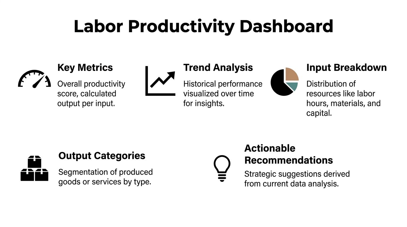
A good dashboard does not throw every metric onto one screen. It helps leaders make staffing, pricing, and client decisions without forcing them to dig through raw exports.
Start with the numbers that change decisions
For most agencies, the dashboard should answer five questions fast:
- How productive is each team right now?
- Which clients produce the strongest output per hour?
- Where are non-billable hours climbing?
- Are trends improving or slipping over time?
- Is output rising because delivery improved, or because inputs rose too?
If the dashboard cannot answer those, it is decoration.
The labor view is not enough on its own
Labor productivity gives one strong lens, but leaders should also watch multifactor productivity when they can.
A broader productivity view includes labor plus other inputs such as software, overhead, materials, and services. One example shows a marketing team generating $500,000 with 10 employees, or $50,000 per employee, but a multifactor view gives a truer picture because it also counts costs like software and overhead, as explained in this Reserve Bank of Australia productivity explainer.
That matters in agencies because some teams look productive only because they consume more tools, more subcontractor spend, or more support cost than leadership sees.
A practical dashboard layout
I like a dashboard built in layers.
| Dashboard layer | What to include | Why leaders need it |
|---|---|---|
| Executive summary | Overall productivity ratio, trend line, billable versus non-billable mix | Fast read for COO or CFO |
| Client view | Productivity by account, margin pressure signals, hours by service line | Pricing and account management decisions |
| Team view | Productivity by department, capacity use, internal load | Staffing and utilization decisions |
| Input view | Labor hours plus software and service cost where available | Closer read on true efficiency |
A team lead needs detail. A CFO needs trend and comparison. One dashboard can do both if it starts broad and then drills down.
Keep the dashboard from becoming a surveillance tool
This matters more than most software vendors admit.
If managers use productivity dashboards to monitor every employee minute by minute, the data quality will fall because people start gaming categories. If leaders use the dashboard to spot account drag, service-line imbalance, and hidden internal load, the numbers stay useful.
A good companion read on this point is how to measure team productivity. It is useful because it frames productivity as a management system, not a policing system.
For agencies building reporting around time data, these performance dashboard examples are a useful reference for how to structure views by team, project, and trend without turning the dashboard into noise.
The dashboard should help leaders ask better questions. It should not tempt them to overread one number.
The best agency dashboards are boring in the right way. They are easy to scan, consistent over time, and tied to decisions someone owns.
From equation to action
The labor productivity equation is simple enough to fit on a whiteboard. What makes it useful is the discipline around it.
For agencies and consulting firms, that means choosing outputs that reflect real value, using hours instead of blunt headcount where possible, and capturing time in a way people can maintain. It also means reading the number with context. A drop in productivity can point to waste, but it can also reflect a shift into necessary internal work, heavier delivery complexity, or a pricing model that no longer fits the work.
Used well, this equation stops vague conversations about busyness. It gives leaders a common operating language for resource allocation, client profitability, and team planning.
If you want the shortest version, it is this:
Measure output clearly. Track hours accurately. Put the number in front of leaders in a form they can use. Then act on the pattern, not the noise.
If your agency is trying to get out of timesheet cleanup mode and into reliable productivity reporting, TimeTackle is worth a look. It uses calendar-based time capture, tagging, and reporting to give teams cleaner hour data for utilization, billing, and ROI analysis without relying on end-of-week memory.