



Engineering teams don't have a productivity problem, they have a measurement problem. If you rank engineers by commits, pull requests, or story points, you get a neat dashboard and bad incentives, because people start optimizing for visible activity instead of shipped value. Senior engineers who prevent incidents, simplify systems, or mentor others can end up looking “less productive” than someone who just moved more tickets.
That's why engineering productivity metrics have to start with the system, not the person. The best measures tell you how fast work moves, how often it breaks, and how quickly teams recover, because productivity is a ratio of input to output and not a count of busyness, as PMI's summary puts it in plain terms, “Engineering productivity is defined as a ratio of input to output” (PMI). Once you treat productivity as flow plus quality, the rest of the conversation gets a lot more honest.
Why most engineering productivity metrics fail
Most engineering dashboards fail for a simple reason, they track what is easy to count, not what matters. Commits, pull requests, tickets closed, and hours logged all feel concrete, but they only tell you that activity happened. They don't tell you whether the work shipped, whether users felt it, or whether the team created more pain downstream.
Activity is not value
I've seen teams reward output volume and then wonder why quality dropped. When you push people toward more commits or more story points, they learn the game fast, split work into smaller chunks, pad estimates, or move low-value work that looks busy. That makes the dashboard look healthier while the product and the platform get harder to change.
There's also a blind spot that hurts senior teams the most. A senior engineer who avoids an incident, untangles a dependency mess, or mentors a newer engineer may have fewer visible artifacts in Git, yet deliver more real value than someone shipping many small changes. Recent guidance on engineering productivity calls that gap out directly, and it argues that leaders should stop overweighting activity measures and start pairing activity with outcome signals instead (LeadDev).
Practical rule: if a metric makes people easier to compare but harder to trust, it's probably the wrong metric.
Good metrics have to trace back to goals
The Abseil engineering book gives the cleanest test I know. Good metrics should be actionable and tied back to goals, and they should cover all parts of productivity so one area doesn't improve while another gets worse (Abseil). That matters because a team can get faster while quality falls, or ship more often while support tickets rise. A dashboard that can't show trade-offs is usually hiding them.
That's why the best measurement systems don't start with “How busy are engineers?” They start with “What does the delivery system produce, how reliably, and at what cost?” Once you put the question there, the rest of the metric set becomes easier to defend, and harder to game.
The metrics that actually measure engineering productivity
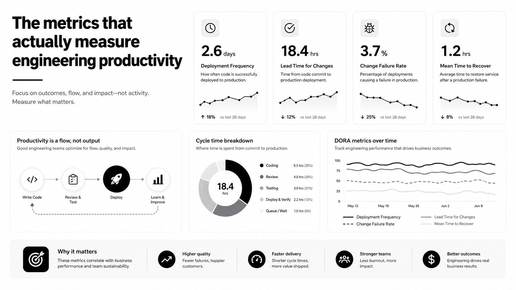
The most useful framework in practice is still DORA, because it keeps the focus on delivery performance rather than personal activity. DORA tracks deployment frequency, lead time for changes, change failure rate, and mean time to recovery, and modern benchmark summaries describe elite teams as shipping multiple times per day or more than 30 times per week, with lead time under 1 hour, MTTR under 1 hour, and change failure rates as low as 0–5% to 15% depending on the benchmark set (Second Talent). Those numbers matter because they describe the shape of a healthy delivery system, not how hard someone looks on a given day.
What each metric tells you
Deployment frequency shows how often the team gets code into production. It's a throughput signal, so it tells you whether the pipeline lets value move or keeps it waiting. Lead time for changes shows how long a code change takes to reach production, and that often exposes review queues, approvals, or deployment gates more clearly than any status report.
Change failure rate tells you how much of that speed turns into rework, rollback, or an incident. MTTR tells you how quickly the team restores service after something breaks, which is a direct read on operational resilience. Worklytics describes elite performance as cycle time under 2.5 days, merge time under 4 hours, deployments multiple times per day, and MTTR under 1 hour, all of which point to a low-friction delivery pipeline (Worklytics).
The important part is the unit of measurement. These are team or system metrics, not individual scorecards. That distinction matters because the same engineer can look productive in one team and ineffective in another if the system around them is slow, messy, or overloaded.
Agile software development metrics often give teams a useful starting point when they want to map work flow before they get into deeper delivery analysis.
How to calculate and interpret each metric
The formulas themselves are simple, and that's a good thing. The hard part is making sure the data comes from the right systems and gets interpreted in context instead of as a score for people. I prefer to think of these as system readings, like pressure and temperature, not report cards.
A practical calculation guide
| Metric | Formula | Data Source | Elite Benchmark |
|---|---|---|---|
| Deployment frequency | Deployments per time period | CI/CD pipeline, release logs | Multiple per day or more than 30 times per week |
| Lead time for changes | Time from code commit to production | Version control, CI/CD | Under 1 hour |
| Cycle time | Time from work start to completion | Work tracking, issue flow data | Under 2.5 days |
| MTTR | Average time to restore service after an incident | Incident management tools | Under 1 hour |
| Change failure rate | Failed deployments divided by total deployments | Deployment and incident records | 0–5% to 15%, depending on the benchmark set |
Rule of thumb: if you need a manual spreadsheet to keep these current, your collection process is too slow to trust.
Where the data should come from
Deployment and lead time should come from your Git and CI/CD systems, because they already know when code moved and when it shipped. MTTR belongs in incident tooling, since that's where response and recovery live. Cycle time usually needs work management data, and calendar or time-tracking platforms such as TimeTackle can help you see how much time teams spend in delivery work versus meetings, support, or admin.
That last point matters because raw delivery timestamps don't explain why flow slows down. If a team spends large blocks of time in recurring meetings or context switching, the delivery data will show the slowdown, but not the cause. Time allocation data fills in that gap without forcing people into timesheet busywork.
How to read the numbers
Don't treat a single metric as proof of health. A fast lead time with a weak change failure rate usually means the team is moving quickly but skipping safeguards. A strong MTTR with a poor deployment frequency often means the team can recover well, but still ships too slowly to keep pace with the business.
That's why I like to review these numbers as a set. One metric tells you speed, one tells you quality, one tells you recovery, and together they tell you whether the delivery system is improving or just getting louder.
Activity metrics versus outcome metrics
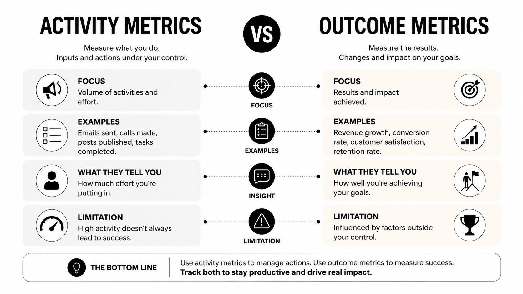
The biggest measurement mistake I see is treating activity metrics as if they were the same thing as outcome metrics. They're not. Commits, pull requests, tickets, and story points can be useful as signals, but only when they help explain a real delivery outcome such as lead time, rework rate, customer adoption, or incident rate.
What to keep and what to retire
Keep activity metrics when they help diagnose flow problems. A sudden drop in PR throughput can point to a build break, a review bottleneck, or a support load spike. Retire them when people start using them as the definition of productivity, because that's when they turn into a game.
Outcome metrics do the opposite job. They tell you whether the team is moving the business forward, which means you can tie engineering work to user impact or operational change instead of just showing motion. That doesn't mean you need a giant dashboard. In practice, the better move is to retire one activity metric and pair it with one outcome metric, which creates enough context to act without filling the page with noise.
A note on people data
If you want a good parallel from hiring, the problems with GitHub as a proxy for real performance are explained well in GitHub bias in technical recruiting. The same lesson applies here. Visible artifacts are easy to count, but they're often a weak stand-in for the work that really changes results.
I also like to keep one qualitative signal in the mix, usually a short developer experience survey. Engineers will tell you when review feels slow, tooling is brittle, or a release process is getting in the way long before the numbers make the story obvious.
Connecting engineering metrics to business outcomes
Engineering metrics only matter when they connect to something the business cares about. A faster deployment cadence means little if customers don't use the new feature, and a lower failure rate means less if the product still ships too late to matter. The useful trick is to build a chain from delivery behavior to product result to business result, and keep each step visible.
Build the chain on purpose
At the top, track engineering movement like deployment frequency and lead time. In the middle, track product and operational results like feature velocity and system stability. At the bottom, track business results like revenue growth and customer satisfaction. That chain gives non-technical leaders a way to read engineering performance without translating from raw technical data every time.
A good metrics hierarchy also keeps context honest. The same target won't fit every team, because a greenfield product group, a maintenance team, and a platform team all have different constraints. The ASCE research is clear that productivity correlates with project size, project type, project priority, phase involvement, degree of modularization, funded front-end planning effort, and quality management (ASCEME.1943-5479.0000059)). In plain English, context changes what good looks like, so one-size-fits-all dashboards break fast.
Use the right lens for the audience
Executives usually care about business outcomes and risk. Engineering managers need flow and quality. Team leads need the handful of signals they can act on this week. If you show everyone the same chart, you get polite confusion and weak decisions.
Performance benchmarking is useful here because it helps teams compare results without flattening the context behind them. That's the standard I'd use when I need to explain why one team's numbers should not be judged against another team's numbers without any frame around the work.
Building dashboards and setting measurement cadence
A good dashboard should help a team decide what to do next. If it only helps leadership admire neat charts, it's missing the point. I've found that the simplest dashboards are usually the ones people keep using, because they don't need a meeting to explain the meeting.
Set the cadence by decision speed
Use daily review for operational metrics that can change fast, such as deployment activity or active incidents. Use weekly review for team-level flow metrics, because that's usually enough time to see a real shift without overreacting to noise. Use monthly review for strategic measures, where you want trend and context more than quick reaction.
Own each metric explicitly. A platform or DevEx lead usually needs to own data quality, because nobody else wants to be the person cleaning broken timestamps across five tools. If ownership is vague, the dashboard gets stale and people stop trusting it.
Build the dashboard around decisions
Start with a small set of measures that answer different questions. One should tell you how fast work moves, one should tell you how stable the system is, and one should tell you whether the team's time is going where you think it is. Then add drill-down views only if someone can act on them.
A few setup choices save a lot of pain later:
- Connect systems directly: Pull delivery data from Git, CI/CD, incident tools, and calendars instead of asking people to re-enter it.
- Separate diagnostic and improvement views: Keep the top-level dashboard clean, then let teams inspect the underlying drivers in a second layer.
- Write down metric rules: Define starts, stops, and exclusions before the first review, so nobody spends the quarter arguing about the math.
- Watch for gaming: If a metric can be pushed up by splitting work into smaller pieces, someone eventually will.
Use the right tooling for the job
For time allocation and meeting load, calendar-based systems can help more than manual timesheets, because they capture what people already schedule rather than what they remember to log later. TimeTackle is one option that connects calendar and work data to show how time gets used across projects and teams, which can be useful when you're trying to understand why flow changed without adding another reporting burden.
Performance dashboard examples can also help teams think about layout and signal density before they build their own version. The goal isn't more charts, it's better decisions.
Real-world implementation and lessons learned
One team I worked with started the same way a lot of teams do, by tracking commits and story points because those were already easy to pull. The dashboard looked active, but it didn't tell us why delivery slowed down, and it missed the engineers doing invisible but valuable work, like clearing blockers and simplifying brittle services.
We changed three things. First, we retired the vanity metrics from the main review. Second, we added DORA-style flow and stability measures at the team level. Third, we paired those with a small set of outcome signals, so leadership could see whether speed changes were helping the product and the business.
The first few reviews were uncomfortable, because the numbers made trade-offs visible. Some teams were shipping faster but also breaking more often, and others looked slower on paper because they were doing the hard work of reducing future risk. Once the dashboard stopped being a scorecard and started being a tool, the conversations got better.
The lesson was simple. Measure the system, not the ego. Keep one eye on flow, one on quality, and one on outcome, then give teams data they can use.
If you want to stop guessing about where engineering time goes, use TimeTackle to pull calendar-based time data into one view and connect it to delivery analysis. It helps teams see workload, focus time, and reporting patterns without living in manual timesheets, which makes engineering productivity metrics easier to trust and act on.