



You can tell a team is in trouble when every meeting starts with the same slide, a dashboard full of numbers nobody trusts. The reorg promised to “ship faster,” but no one could say what faster meant, who owned the metric, or what trade-off they were willing to accept. I've rolled out engineering metrics three times, and the lesson was the same each time, if a number doesn't drive a decision, it becomes wallpaper.
The mistake most leaders make is reaching for activity counts because they're easy to collect. Commits, tickets closed, lines of code, and hours logged feel objective, but they mostly reward busyness and punish the people doing hard, invisible work. Strong engineering team metrics answer a different question, what decision does this number support, and who gets to act on it?
Why most engineering dashboards fail before they start
The first dashboard I inherited had everything on it except meaning. It showed commit volume, PR counts, sprint points, and a few red and green lights, but it never said what “good” looked like, so every manager read it differently and every engineer got a different message. That is how dashboards turn political instead of useful.
Start with the decision, then build the chart. If the view is for a team to improve flow, keep it in a team-facing dashboard. If the view is for leadership to understand organizational risk, keep it in a leadership dashboard, and do not mix the two. Swarmia makes the same point clearly, metrics should be visible to everyone and labeled as either “for teams to use” or “about teams for organizational visibility” Swarmia's leadership framework for engineering metrics.
That split matters because teams should not be judged on numbers they cannot control. Leaders also need aggregate patterns, not personal scorecards. If you want a clean example of the same separation in another function, the way a PEO financial performance dashboard separates business health from individual behavior is a good model to study, even if your engineering stack looks nothing like payroll reporting.
Dashboards also fail when the design buries the point. Use the data visualization best practices for 2025 and keep the chart count small. Do not make people hunt through six tabs to find the one signal that matters this week. Put the decision on the page with the number, or leave the number off the page.
Practical rule: if a metric cannot be tied to a decision, do not put it on a dashboard yet.
The core engineering metrics you need to know
Start with the DORA core
The most defensible baseline is still the DORA set, deployment frequency, lead time for changes, change failure rate, and mean time to recovery. These are team-level delivery and reliability signals, and they're stronger than individual activity counts because they measure how the system performs, not how busy one person looks engineering velocity metrics explained. If deployment frequency rises while change failure rate also rises, you've bought speed with risk, and that trade-off should be explicit.
Cycle time is the full time a pull request spends moving through the pipeline. Lead time is the time from a change starting until it's in production. Teams blur those two terms all the time, then wonder why their numbers don't match. One shows flow through the development process, the other shows time to user value.
Throughput tells you how much work clears the system, while defect rate and escaped defects tell you how much bad work gets out. Code churn shows where code gets rewritten often, which can mean learning, rework, or unstable requirements. PR review metrics matter too, especially review turnaround time, review depth, and review participation, because a fast pipeline still slows down if reviews pile up.
Team-level delivery signal: use metrics that describe how work moves from change to release.
Activity count trap: don't confuse commits, lines of code, or hours logged with productivity.
If you want a more executive-facing comparison, metrics for portfolio role executives is useful because it pushes the same idea, numbers need an audience and a purpose.
What each metric leaves out
Cycle time won't tell you whether the code was any good. Deployment frequency won't tell you whether customers saw a broken release. Change failure rate won't show the size of the incident, only that you had one. That's why I don't let teams chase one metric in isolation, because the minute they do, they start optimizing the gap between the number and reality.
The right habit is to pair a speed metric with a safety metric, and a delivery metric with a review metric. That gives you a working picture, not a vanity race. It also keeps one part of the organization from claiming victory while another part absorbs the fallout.
If you want a second lens on flow and staffing, resource planning in software engineering is a practical way to think about capacity without slipping into heroics.
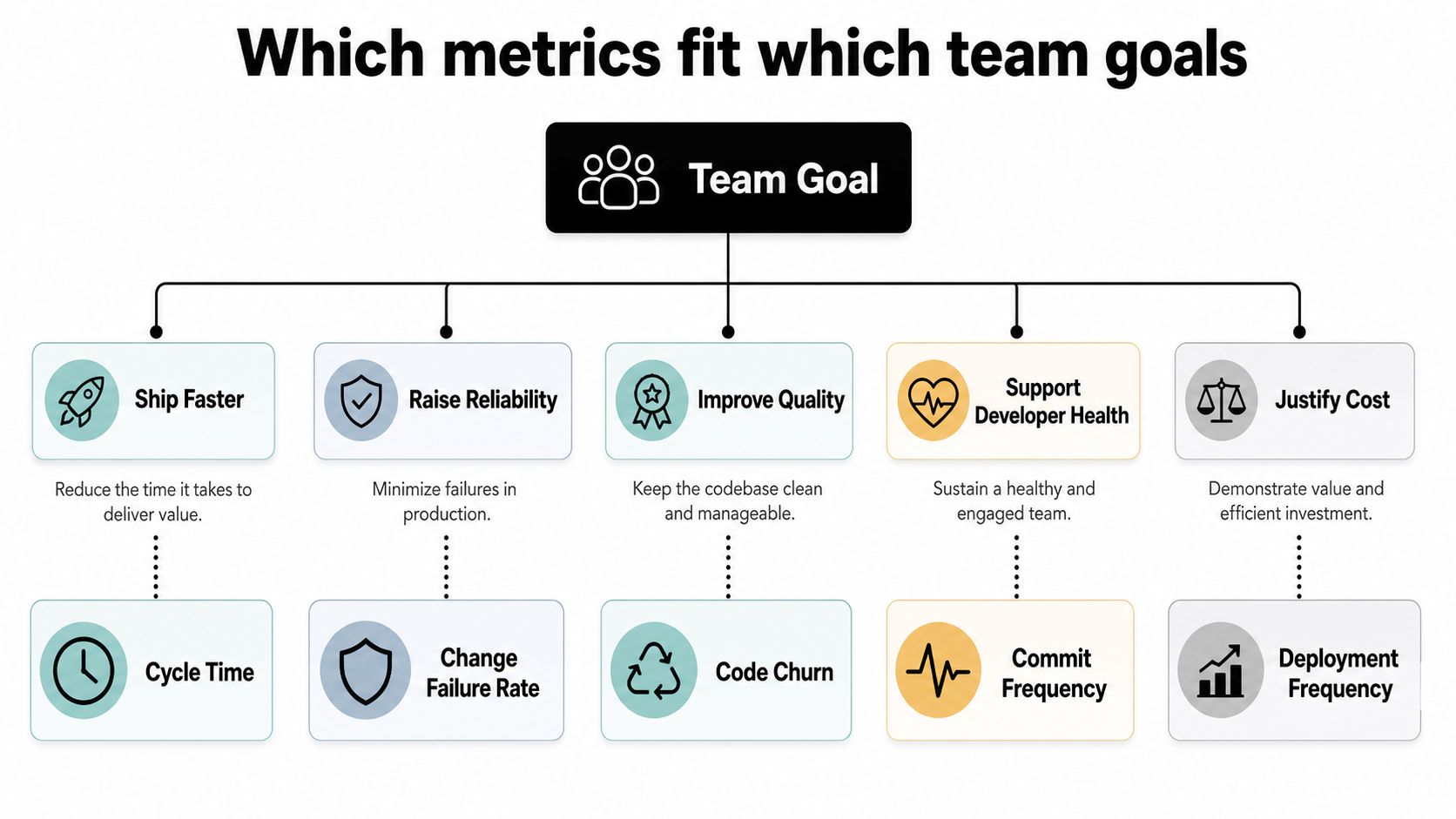
Which metrics fit which team goals
Ship faster, but not sloppier
If the goal is faster shipping, I want cycle time, lead time, and deployment frequency in view. I do not start with MTTR here, because recovery time tells you how fast you bounce back after a problem, not how fast work reaches users. A team that ships slowly but recovers fast still has a delivery problem.
The trap is mixing goals. A director who wants shorter time to market should care about review wait, batch size, and deployment flow before anything else. If they jump straight to incident metrics, they'll end up fixing the wrong bottleneck.
Raise reliability without hiding the cost
If the problem is incidents, I care about change failure rate, MTTR, and deployment rework rate. Those three numbers tell a more honest story than a single uptime graph, because they separate bad releases from bad recovery and from reactive work. A team can lower one and still have a mess in the other two.
Improve quality and developer health
If quality is slipping, code churn, escaped defects, and review depth deserve attention. If the team is running hot, then focus time, interruption rate, and rework matter just as much, because speed that burns people out is borrowed speed. That's the part most metric guides still miss, and I think that's a mistake.
Justify cost with output, not busyness
If leadership wants to understand cost, track engineering spend against output and use the right denominator. Engineering productivity and output planning is useful here because it ties work flow to business decisions instead of treating “output” as a vague feeling. Cost only matters when you can connect it to value, and value only matters when you can explain the trade-off.
Decide which metrics are for teams to act on and which are about teams for leadership visibility. The first group belongs in retros, working agreements, and team discussions. The second group belongs in rollups, funding talks, and portfolio reviews, and it should never become a performance review weapon.
Benchmark numbers worth knowing in 2026
A benchmark is not a target. It's a sanity check, so you can tell the difference between healthy variation and a real problem. The 2026 elite targets that keep showing up are under 2 days for cycle time, under 4 hours for first PR review, under 1 hour for lead time from commit to production, under 1 hour for MTTR, multiple deployments per day, and 0% to 15% change failure rate 2026 engineering productivity metrics benchmark data. The same source also points to above 40% flow efficiency, 95%+ code review coverage, and more than 4 uninterrupted focus hours per day as healthy signals.
| Metric | Elite target | Typical mid-market range | What it tells you |
|---|---|---|---|
| Cycle time | Under 2 days | Varies by team and work type | How quickly work moves through the pipeline |
| First PR review | Under 4 hours | Hours to a day is common | Whether review is actually being prioritized |
| Lead time from commit to production | Under 1 hour | Often longer in mixed-release shops | How fast code reaches users |
| Mean time to recovery | Under 1 hour | Depends on incident maturity | How fast the team restores service |
| Deployment frequency | Multiple deployments per day | From daily to much less | How often the team ships to production |
| Change failure rate | 0% to 15% | Higher than this needs attention | How often releases need immediate intervention |
I'd use these numbers carefully. They tell you direction and pressure, not virtue. A team with slower numbers might be doing safer work, and a team with elite numbers might be hiding shortcuts.
The same goes for flow efficiency and review coverage. Those numbers are useful because they reveal drag in the system, but they don't replace judgment. If the metric is moving in the right direction and the team still feels broken, trust the team.
How metrics get misused and gamed
Every metric creates a loophole. That's not a flaw in measurement, it's what people do when they know the number matters. If you don't define the misbehavior up front, the dashboard will get optimized against the team.
The common tricks
A team can inflate deployment frequency by shipping empty releases or tiny no-op changes. They can hit lead time targets by pushing bigger PRs through review faster, which usually makes the review stage worse later. They can make MTTR look good by silencing alerts or delaying incident declaration. They can also keep change failure rate low while letting quality decay slowly, which is how you end up with a system that looks safe until it isn't.
The political misuse is worse. DORA metrics are team signals, not individual scorecards, and putting them into performance reviews changes the behavior fast. People stop surfacing problems, people split work to protect the number, and the whole point of the metric disappears.
A metric without a stated misbehavior rule is a metric that will be optimized against the team.
What I put in place before launch
I set three guardrails. First, every metric gets a named owner and a named audience. Second, every metric gets an explicit list of things it will never be used for, including individual evaluation unless the metric was designed for that purpose. Third, I ask teams to write down the main way someone might game it, so we can watch for it early.
That sounds basic because it is. Most metric failures I've seen weren't math failures. They were trust failures.
Dashboards and reporting cadence that people actually open
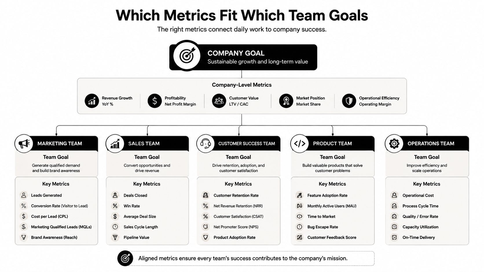
A dashboard should answer a role, not collect every available number. For an engineering lead, I'd keep the view tight, with cycle time, PR review health, and active incidents front and center. For a director, I'd move up a level and show team trends, flow efficiency, and escaped defects, because that's where cross-team patterns start to matter.
For an executive, I'd show two or three numbers tied to business outcomes, not twelve engineering internals. That usually means incidents, roadmap risk, and engineering cost per unit of output. If the dashboard needs a legend to explain every number, it's already too busy.
Keep the cadence simple
- Daily: Send a Slack ping for incidents and blocked work.
- Weekly: Share a written review of trends, blockers, and any metric that moved sharply.
- Monthly: Give executives a short summary that ties metric movement to product choices or operating cost.
That cadence keeps the dashboard alive without making it noisy. Daily data is for action, weekly data is for learning, and monthly data is for decisions. If you collapse those three into one report, people stop opening it.
I'd also connect calendar data to engineering systems where possible, because focus time, interruptions, and delivery pressure live in the same week. That's where a calendar-based platform such as TimeTackle can fit, since it captures activity patterns and helps you see how work is spread across teams without another manual reporting layer. I've seen that kind of view make resource conversations a lot more honest.
A two-week rollout that doesn't break trust
Week one is for restraint. Pick 3 to 5 metrics tied to one current pain point, write the decision each metric should inform, and name who will use it. Don't start with a warehouse of numbers, because that just recreates the same confusion in a cleaner font.
Week two is for wiring and patience. Pull data from GitHub, CI/CD, incident tools, and calendar or time-tracking systems, then baseline the numbers for two to four weeks before you set targets. If you set targets before you know the shape of the system, you're guessing and everyone can feel it.
The rollout checklist I'd actually use
- Choose the pain point first. Slow reviews, too many incidents, unpredictable delivery, or unclear cost are all valid starting points.
- Name the audience. Team, director, or executive, not all three at once.
- Write the misbehavior rule. Say how someone might game the number and how you'll prevent it.
- Label visibility. Make it clear which metrics are for teams and which are for leadership visibility.
- Retire stale metrics quarterly. If a number isn't changing decisions, it doesn't earn a permanent slot.
The trust piece is the part most rollouts miss. People need to know the dashboard is there to help them improve the system, not to turn every engineer into a line item. If you can't say that plainly, don't launch yet.
Connecting metrics to business outcomes
Engineering metrics earn their keep when they change a business call. Incidents and MTTR affect customer pain and the support burden that follows. Lead time and throughput affect roadmap risk, because delayed work costs more than delayed reporting ever will. Change failure rate shows up again in support costs, while focus time and rework are the first places I look when attrition starts creeping up.
That's why I don't want leaders chasing a giant stack of charts. I want them to pick a few numbers, label them by audience, baseline before benchmarking, write down the misbehavior rules, and retire metrics that stopped moving decisions. That's the whole job.
The best engineering dashboards don't make engineers feel watched. They make the rest of the company make better calls, with fewer surprises and less theater.
If you want a cleaner way to connect calendar time, workload, and reporting without manual spreadsheet work, TimeTackle can help teams capture activity patterns and turn them into operational views. It fits naturally alongside engineering team metrics when you need to see how focus time, planning, and delivery pressure shape output. Visit TimeTackle to see how calendar-based reporting can support better resource planning and clearer engineering decisions.