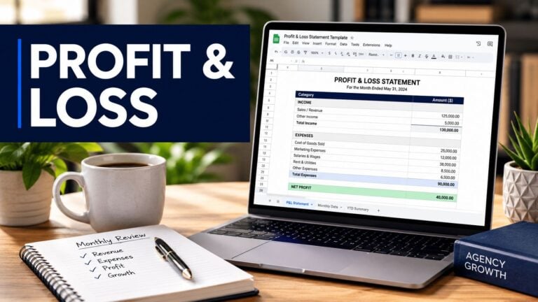
If you run operations at an agency, you know the month-end ritual. Someone exports CRM data. Someone else chases timesheets. Project leads send updates in different formats. Finance wants utilization, delivery wants staffing visibility, and leadership wants a clean answer on margin by client.
By the time the report is done, it's already old.
That's why so many teams end up talking about dashboards the wrong way. They obsess over charts, widgets, and layouts, when the core problem starts much earlier. If the data comes in late, gets entered by hand, or depends on people remembering what they did last Tuesday, no performance analytics dashboard will save you. You'll just get a prettier version of the same reporting mess.
The endless cycle of manual reporting
The failure pattern is familiar. Ops pulls hours from one system, pipeline data from another, and project status from a third. Then someone tries to stitch all of it together in a spreadsheet that keeps growing tabs and formulas until nobody wants to touch it.
That work doesn't just eat time. It also creates delay, which means leaders make decisions from stale numbers. According to a 2023 report cited by Aelum Consulting's ServiceNow performance analytics guide, organizations that implemented performance analytics dashboards saw a 37% average increase in operational efficiency within the first six months, and 68% reduced manual reporting overhead by at least 25 hours per week after integrating dashboards.
The emotional cost is easy to miss, but it matters. Teams stop trusting the report when they know the numbers were patched together at the end of the month. Managers argue over inputs instead of acting on outputs. Finance doubts utilization. Delivery doubts profitability. Nobody feels like they're looking at the same business.
What manual reporting feels like in practice
A typical agency report often depends on all of this at once:
- Calendar memory gaps: Team members try to rebuild their week from memory, which usually means missed internal work, unlogged client calls, and vague time entries.
- CRM exports: Sales data gets pulled into a spreadsheet, then someone manually maps opportunities or accounts to projects.
- Project updates by message: Slack notes, email summaries, and PM tool comments get copied into a status deck.
- Last-minute cleanup: Ops spends hours fixing naming mismatches, duplicate entries, and billable classifications.
If that sounds normal, that's the problem.
Practical rule: If your reporting process depends on people typing in yesterday's work after the fact, your dashboard isn't your system. Your memory is.
A better path starts by changing the reporting model, not just the visual layer. That's the shift behind automated reporting software for agency operations. The point isn't to make reports prettier. It's to stop rebuilding the same report every month from scratch.
What a real performance dashboard is (and isn't)
A real performance analytics dashboard isn't a wall of charts. It's a working view of the business that helps leaders answer the next question fast.
ServiceNow describes it clearly in its knowledge base article on performance analytics dashboards: the dashboard visualizes business process data collected over time to reveal trends that support real-time decision-making, combining trend widgets, reports, and dashboards to monitor business service performance with breakdowns that let users define indicators, collect data, and view results by category.
That definition matters because most agency dashboards fail for one simple reason. They report history, but they don't help anyone decide what to do next.
The brochure version versus the instrument panel
A vanity dashboard is like a glossy car brochure. It looks polished, it has nice visuals, and it makes everyone feel like they bought something advanced.
A real dashboard is the instrument panel. You use it while you drive. You check speed, fuel, warnings, and direction. If a number moves the wrong way, you know where to look next.
That difference shows up in how the dashboard behaves.
| Dashboard that gets ignored | Dashboard that gets used |
|---|---|
| Static screenshots in a slide deck | Live filters and current data |
| One view for everyone | Different views by role |
| Monthly summary only | Trend lines and current status |
| Charts without context | Metrics tied to action |
What it should let you do
The right setup should answer operational questions without sending you back to spreadsheets.
- For a COO: Which teams are underbooked this week, and is that a staffing issue or a pipeline issue?
- For a CFO: Which client accounts look healthy on revenue but weak on margin once non-billable load is included?
- For a delivery lead: Where is work slipping, and is it linked to meeting overload, poor scoping, or bad handoffs?
- For account leadership: Which clients consume more senior time than the retainer supports?
That's why I push teams to study working models before they build anything. Looking at performance dashboard examples for operations teams is useful, but only if you judge them by one standard. Can a manager spot a problem and get to the cause without opening five more tools?
If the answer is no, it's not really a performance analytics dashboard. It's a report archive with better colors.
Choosing metrics that drive agency growth
A dashboard starts paying off when the metrics change decisions. Agencies get into trouble when they fill the screen with activity counts because those fields are easy to export from a project tool or CRM. Busy is easy to measure. Healthy growth is not.
The metrics that matter tie revenue, delivery effort, and client behavior together. Bain & Company has long argued that retention economics drive outsized profit gains in service businesses, which is why agencies need performance views that connect day-to-day operations to client renewal and expansion, not just output volume.
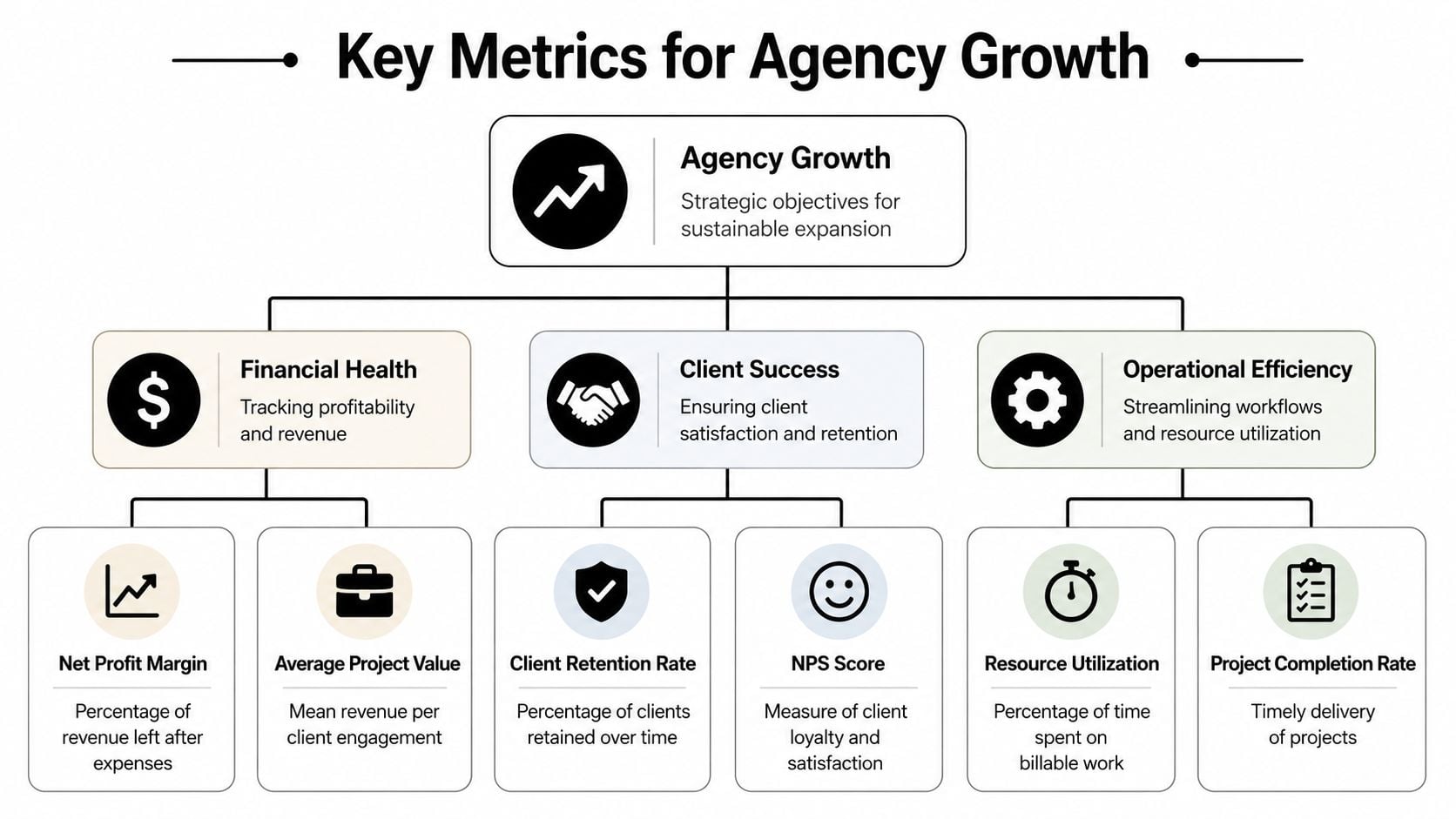
Start with financial health
I want the money view first because agencies can look fully utilized while quietly losing margin. A packed team does not guarantee a strong business.
These metrics usually deserve top placement:
- Client profitability: Compare recognized revenue with delivery cost by account, including senior oversight and revision time.
- Margin trend by account: Trend lines matter more than a single month because struggling accounts often decline gradually.
- Average project value: Small jobs can consume disproportionate coordination time and push out better work.
- Realization rate: Track how much of the work delivered converts into billable revenue.
- Revenue per billable hour: Useful for spotting service lines that stay busy but underperform financially.
One blind spot is email performance. Agencies running outbound campaigns or lifecycle programs can misread account performance when inbox placement is weak. A tool like MailGenius email deliverability tool helps separate deliverability problems from campaign execution problems.
Then measure client quality, not just client satisfaction
Client success should show whether an account is stable, growing, and worth serving at the current level of effort.
I track a small set of signals that combine commercial value with operational load:
- Retention and renewal rate
- Expansion revenue by account
- Scope change frequency
- Unplanned work volume
- Response time to client blockers
- Executive escalation count
A client can score well in a quarterly survey and still damage the business through constant rush requests, poor approvals, and margin erosion. The dashboard should expose that pattern early.
Operational metrics should explain the economics
This is usually where agency leaders find the underlying issue. Margin problems often start as staffing problems, meeting load, bad scoping, or too much senior time spent on accounts that cannot support it.
The operational layer should answer questions like these:
- Billable versus non-billable mix by team
- Utilization by role and manager
- Capacity gap for the next two to four weeks
- Internal meeting time versus client delivery time
- Project completion rate against planned timeline
- Rework or revision load by client and project type
The key is choosing metrics that connect to an action. If utilization drops, a manager should know whether to rebalance work, fix pipeline quality, or cut meeting overhead. If margin slips on one account, leadership should see whether the cause is scope creep, delivery inefficiency, or too much non-billable support.
That is the standard I use. Every metric on the dashboard should help someone price better, staff better, protect margin, or keep a good client longer.
The data capture trap that dooms most dashboards
The hardest part of dashboarding isn't visual design. It's getting clean data into the system without asking busy people to do extra admin work.
Most guides skip that. They talk about KPIs, visual layouts, and executive reporting, but ignore the source problem. According to a source cited in this discussion of dashboard pain points, 68% of mid-sized professional service firms report that manual data entry into dashboards consumes over 15 hours weekly, and vendors rarely explain how to bridge calendar events to dashboard KPIs without custom scripting.

Why manual entry breaks trust
Manual entry sounds manageable when you're planning a dashboard project. It rarely stays manageable for long.
People forget details. Naming conventions drift. One manager logs internal workshops as non-billable strategy, another logs the same work as training, and a third forgets to log it at all. Then leadership stares at a dashboard and wonders why the trend feels wrong.
That's not a dashboard problem. It's a capture problem.
Here's where dashboards usually go off track:
- Timesheets get filled late: Reconstructed time is less accurate than captured time.
- Context gets lost: A calendar event may contain the client, attendees, and subject line, while a manual time entry often reduces that into one vague label.
- Ops becomes a cleanup team: Instead of analyzing performance, ops spends the week fixing categories and chasing missing entries.
- Adoption falls apart: Once teams see the system as admin work, quality drops fast.
The hidden cost isn't just time
The obvious cost is the weekly admin burden. The bigger cost is bad decisions.
If your utilization looks low because internal meetings weren't captured correctly, you may overreact and push for more billable work when scheduling load is the underlying problem. If margin looks weak because time wasn't mapped to the right project, you might blame pricing when delivery classification is the core problem.
Field note: Teams don't reject dashboards because they hate metrics. They reject dashboards when the numbers feel wrong.
That's why I tell ops leaders to reverse the usual project order. Don't start with widgets. Start with capture rules, source systems, naming logic, and ownership. Once that foundation is stable, the performance analytics dashboard becomes useful. Before that, it's just a polished argument generator.
How to design a dashboard that people actually use
When the data is reliable, design starts to matter. Not visual polish for its own sake, but design that helps a leader move from signal to action without friction.
The biggest upgrade is interactivity. According to Emergys' overview of ServiceNow performance analytics features, dashboards built with interactive elements such as filters and drill-downs reduce report generation time by 40% and improve data interpretation accuracy by helping stakeholders find root causes in real time.
Build for roles, not for the org chart
One dashboard for everyone sounds efficient. In practice, it usually pleases nobody.
An executive needs a compact business view. A department lead needs team and client detail. A project manager needs to trace changes quickly and understand what moved.
I usually separate views like this:
- Exec view: Margin, utilization trend, capacity pressure, client risk.
- Team lead view: Workload by person, billable mix, internal load, project delivery status.
- Project view: Time by phase, variance against plan, client effort pattern, blockers.
Make the next click obvious
Good drill-down design answers the next question naturally. If overall billable utilization dips, a COO should be able to filter by team, then by manager, then by client or project without leaving the dashboard.
That only works if the structure is disciplined. Filters need clear field logic. Naming has to stay consistent. Time periods should behave the same across views. If every chart uses a different definition of “client work,” trust disappears again.
A simple checklist helps:
| Design question | What good looks like |
|---|---|
| Can leaders filter fast? | Date, team, client, project, and role filters are easy to find |
| Can users explain a change? | Drill-downs lead from summary to source detail |
| Do views match each role? | Exec, manager, and delivery views answer different questions |
| Does the dashboard stay readable? | Fewer metrics, better grouping, clear trends |
“If a manager can't explain a red number within a few clicks, the dashboard is unfinished.”
The point is speed to understanding. A dashboard people use feels less like a report and more like a control surface.
Connecting the dots with calendar and CRM integrations
Most agency reporting systems either become reliable or stay fragile at this stage. The cleanest source of time data often isn't the timesheet. It's the calendar.
Meetings, calls, workshops, reviews, internal planning, and client check-ins already live in Google Calendar or Outlook. CRM systems hold account, opportunity, and client context. Project tools hold delivery status. When you connect those systems properly, you stop asking people to recreate work after the fact.
![]()
The logic that actually works
A practical pipeline looks like this:
- Calendar first: Capture events from Google or Outlook because that's where much of the day already gets recorded.
- CRM second: Map calendar activity to clients, deals, accounts, or opportunities using shared identifiers and rules.
- Project context next: Pull project or task references so delivery work lands in the right bucket.
- Analytics layer last: Push normalized records into the dashboard, BI tool, or reporting workspace.
For teams that manage cross-platform calendars, this matters even more. If staff switch between calendar environments, your reporting quality depends on a clean sync before analytics even starts.
One example of the model in practice
TimeTackle is built around this approach. Teams connect Google or Outlook calendars and CRMs to automatically capture activities, then apply tags, properties, and rule-based automations so work gets categorized with less manual effort. That data can then feed dynamic reporting views by project, client, team, or opportunity, and it can move outward through API and data integration workflows when a company wants analysis in another system.
What matters here isn't the brand. It's the operating model.
A reliable setup usually includes:
- Automatic capture: The system reads activity from tools people already use.
- Rule-based categorization: Shared rules assign client, project, or work type without asking each employee to make every choice manually.
- Exception handling: People only review ambiguous records instead of logging everything from scratch.
- Export flexibility: Finance, ops, and leadership can still analyze the same core data in their preferred environment.
That's the shift most guides miss. Dashboards become trustworthy when data capture happens close to the work itself. In agency life, that often starts with the calendar.
From reactive reporting to proactive leadership
Monday starts with a client asking why delivery slipped. By Tuesday, ops is pulling calendar data, CRM notes, and late timesheets into a spreadsheet to explain what happened. By Friday, leadership has a clean report on a problem that already affected the client.
That pattern is common in agencies that report after the fact instead of managing in real time. The issue usually is not dashboard design. It is the delay between work happening and reliable data showing up in the dashboard.
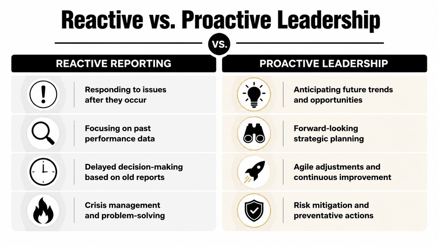
What reactive reporting looks like
Reactive reporting has a familiar smell to it. People are busy, but nobody can answer a simple operating question without cleanup first.
- Manual inputs still run the process: Teams fill gaps from memory, then ops reconciles the damage later.
- Meetings revolve around static snapshots: Leaders review exported slides instead of testing a live question and drilling into the cause.
- Attention goes to easy metrics: Activity counts look polished while utilization, delivery risk, margin pressure, and account load stay fuzzy.
- The client becomes the alert system: Problems get flagged only after trust starts to erode.
I have seen this in agencies that thought they had a reporting stack because they had charts. Instead, they had a month-end storytelling process.
What proactive leadership requires
Proactive leadership starts earlier. The dashboard needs current, structured inputs from the systems people already use, especially calendars and CRMs, because that is where delivery activity, meetings, handoffs, and account motion show up first.
Then the dashboard has to help managers act. A good view lets them spot drift this week, trace it to a client, team, or workflow, and decide what to change. That might mean rebalancing meeting load, pulling a senior person out of low-value calls, or catching an account that is absorbing too much unplanned time.
The goal is not prettier reporting. The goal is intervention while there is still time to fix the issue.
That is the difference between watching the business and running it. Leaders stop asking only what happened last month. They start asking where capacity is tightening, which accounts are starting to wobble, and where delivery is likely to miss before revenue or retention takes the hit.
A performance analytics dashboard earns its place when it changes those conversations. If it cannot surface risk early enough to affect staffing, delivery, or client management, it is still a reporting artifact.
If your team is stuck in spreadsheet cleanup, late timesheets, and month-end guesswork, TimeTackle is worth a look. It captures work from calendars and connected systems, applies rules to categorize it, and gives ops, finance, and delivery teams a cleaner base for utilization, ROI, and performance reporting without asking people to rebuild their week by hand.